THRIVE

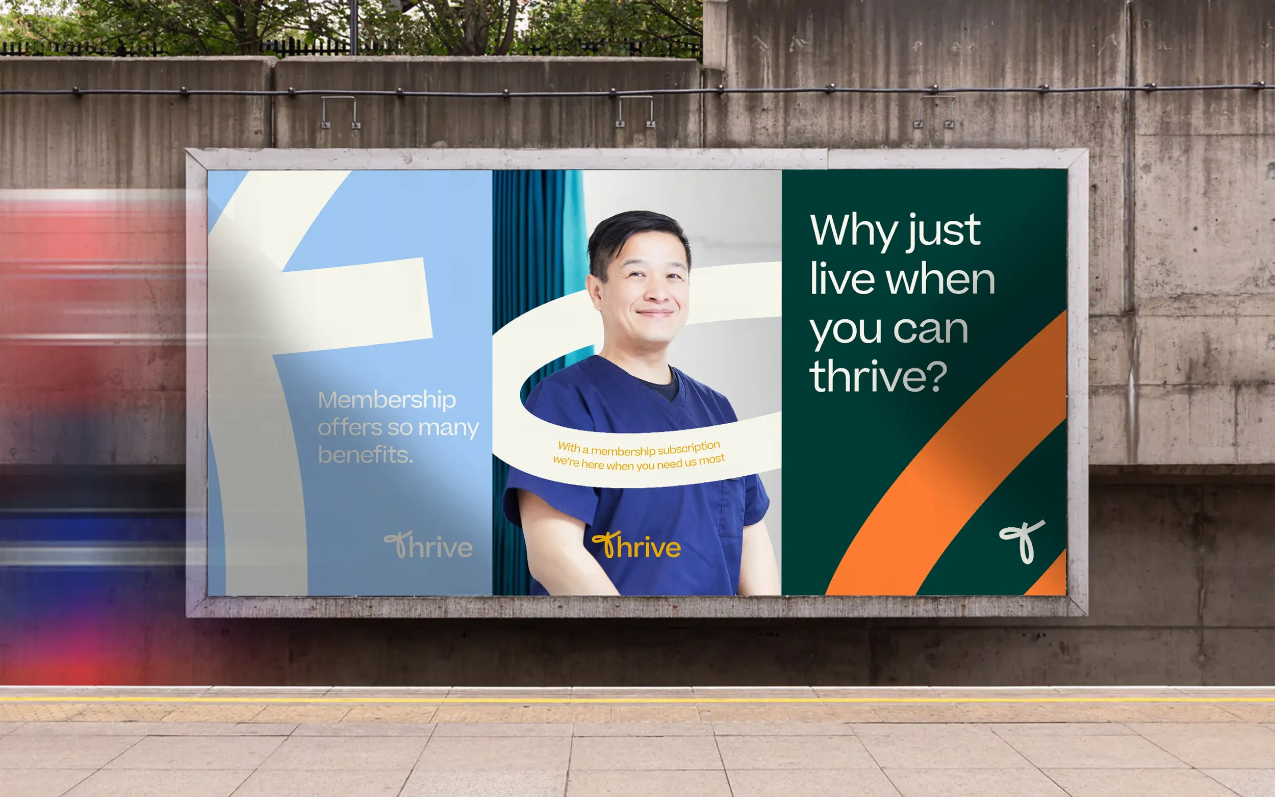
WHY JUST LIVE WHEN YOU CAN THRIVE?
-
Private healthcare designed around you
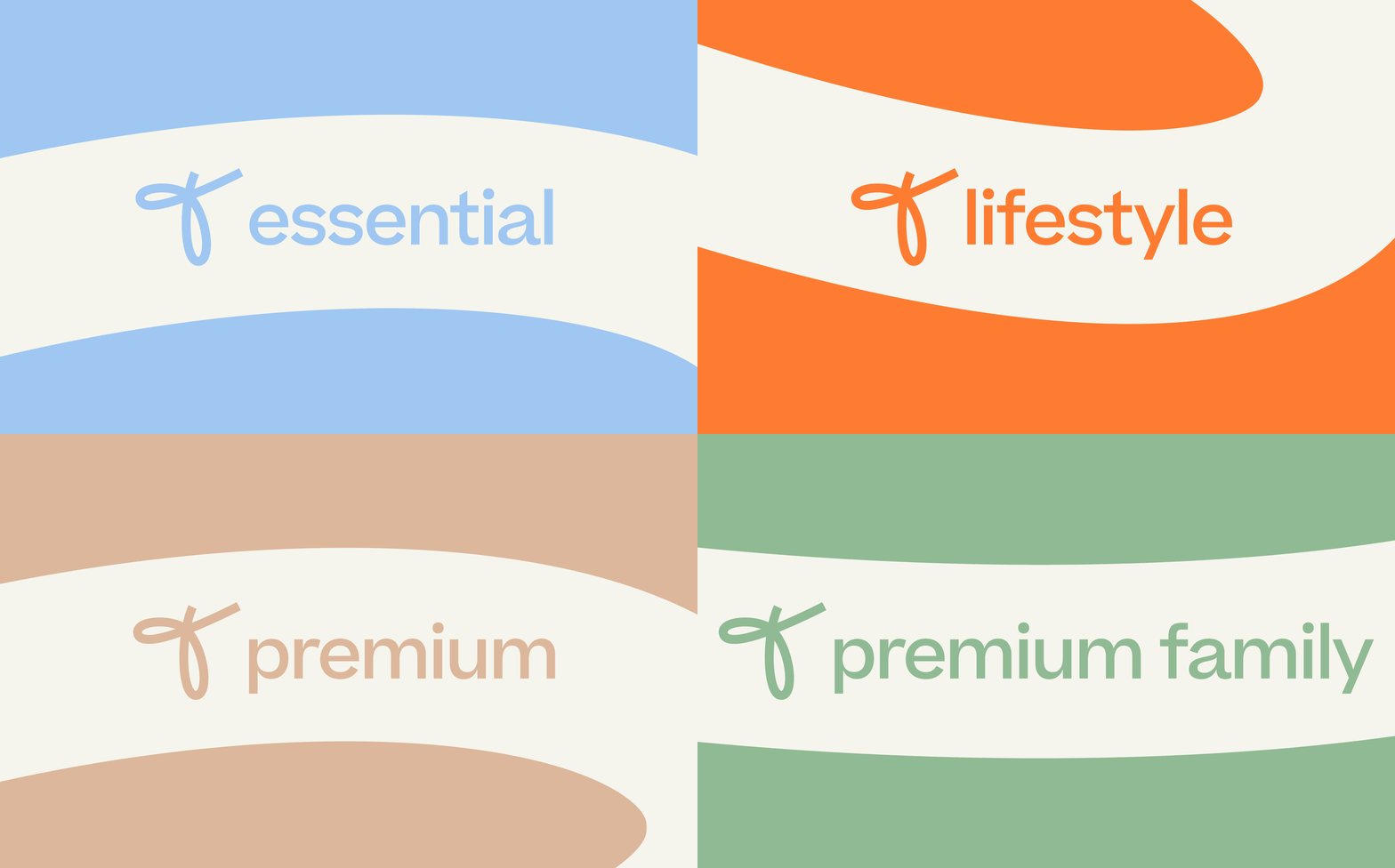
Thrive was created by Pall Mall to make high-quality private healthcare more accessible through a range of simple monthly subscription plans. Designed for people who want quick and convenient access to healthcare without the need for private medical insurance, each plan includes unlimited GP appointments and a health screen, with additional services available depending on the level of membership. Four different plans, one simple idea: helping people take better care of their health. Thriving. -
Making private healthcare more accessible
Having already created the wider Pall Mall identity, we were approached to develop a new sub-brand for an entirely new proposition. Thrive would offer access to a range of private healthcare services through a monthly subscription, making the benefits of private healthcare available to a much wider audience.Unlike traditional private medical insurance, Thrive was designed to be straightforward, accessible and affordable. Its audience was equally broad, ranging from existing Pall Mall medical and cosmetic patients to individuals, couples and families looking for greater control over their healthcare.
The challenge was to create an identity that could stand confidently on its own while remaining unmistakably part of Pall Mall. It needed to communicate the quality and reassurance associated with the parent brand, but with a warmer, friendlier and more energetic personality. Most importantly, it needed to explain the benefits of the subscription plans without ever feeling overly complicated, pushy or sales-led.
-
A healthier outlook
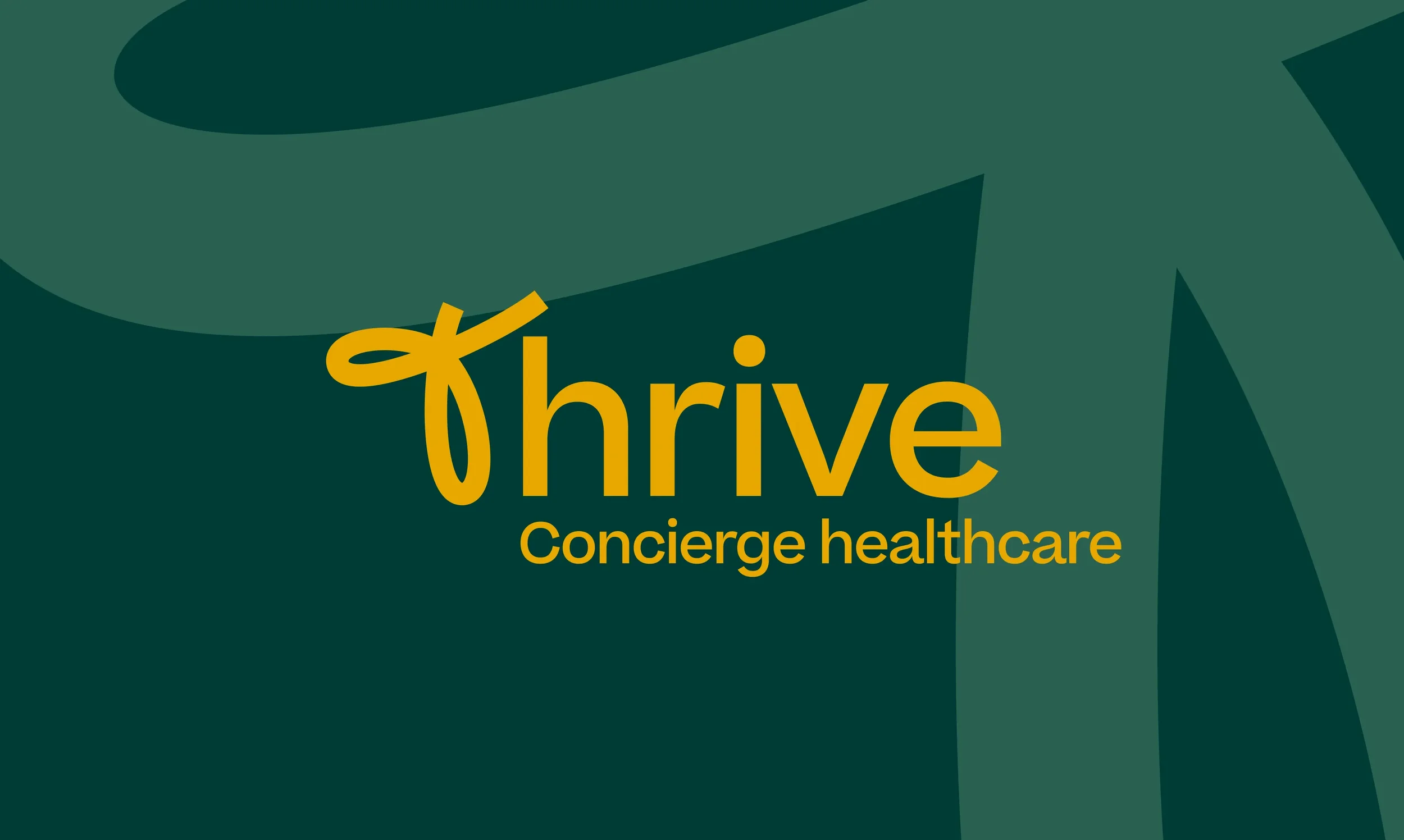
Three creative routes were explored, with the chosen direction taking familiar elements from the Pall Mall identity and reinterpreting them for a more consumer-focused audience.The Thrive wordmark was set in Beatrice Medium, retaining an immediate typographic connection with Pall Mall, but it was the hand-drawn ‘T’ that became the defining element of the new identity. Created in the same single-line style as Pall Mall’s illustration system, the ‘T’ provided a natural link between parent and sub-brand while giving Thrive something distinctive to call its own.
That ‘T’ became a bold and adaptable graphic device across the identity. It could interact with photography, provide a framework for messaging or be enlarged and cropped to create simple, impactful compositions. Used consistently across different applications, it gave Thrive an instantly recognisable visual language while retaining the warmth and humanity required of a healthcare brand.
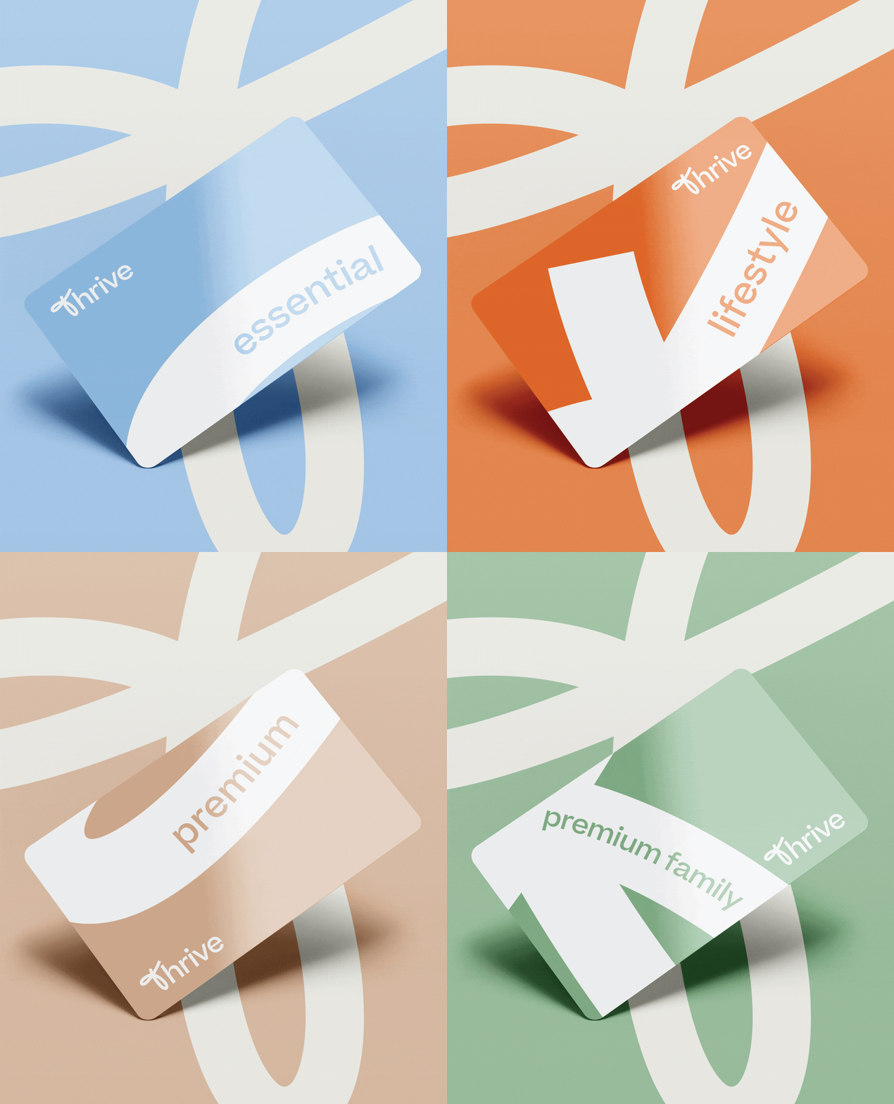
Pall Mall’s distinctive mustard was retained as the primary connection to the parent identity, but complemented by a new secondary palette that was deliberately brighter, bolder and more energetic. Each of the four subscription plans was assigned its own colour, helping customers distinguish between the different levels of membership while bringing clarity and structure to the wider proposition.
Photography, typography and tone of voice were all carefully considered to make the brand feel approachable and inclusive. Rather than focusing on illness or treatment, the identity centred on the positive benefits of taking control of your health; communicating reassurance and accessibility without losing the professionalism and credibility associated with Pall Mall.
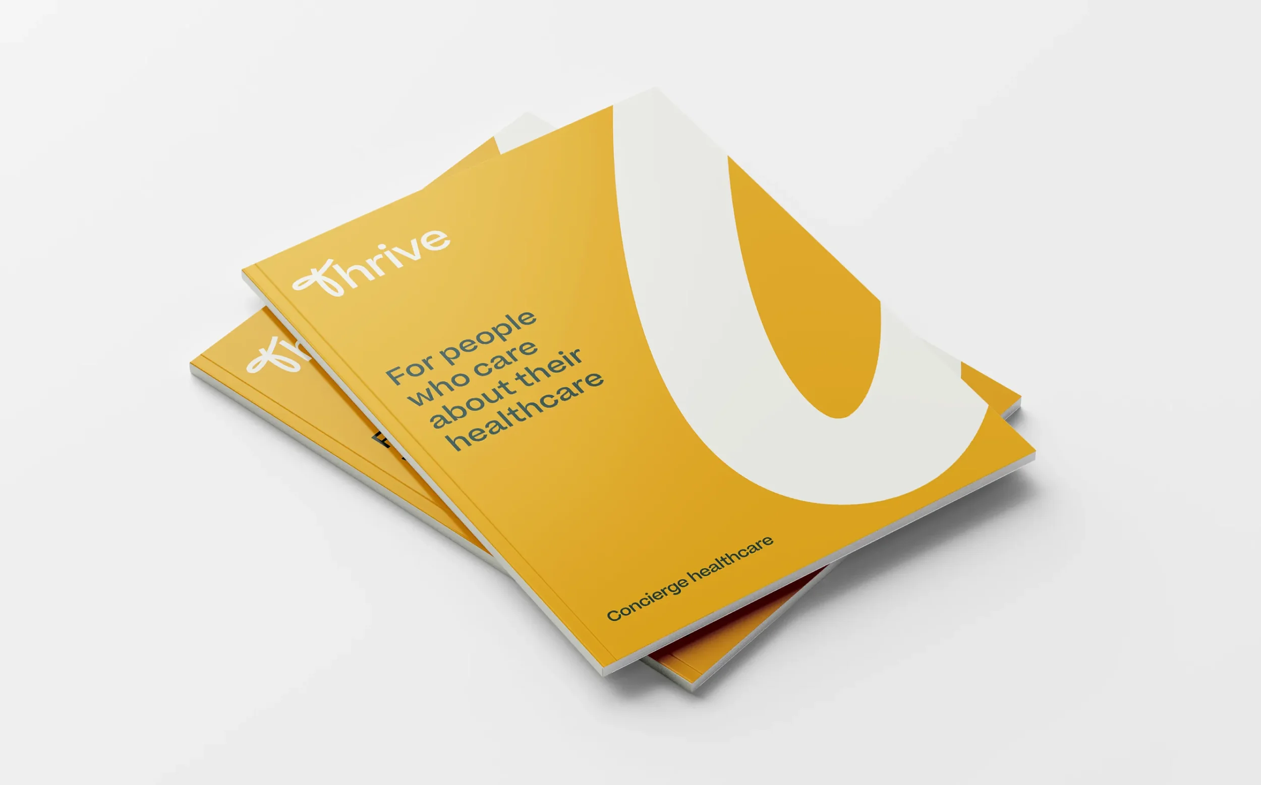
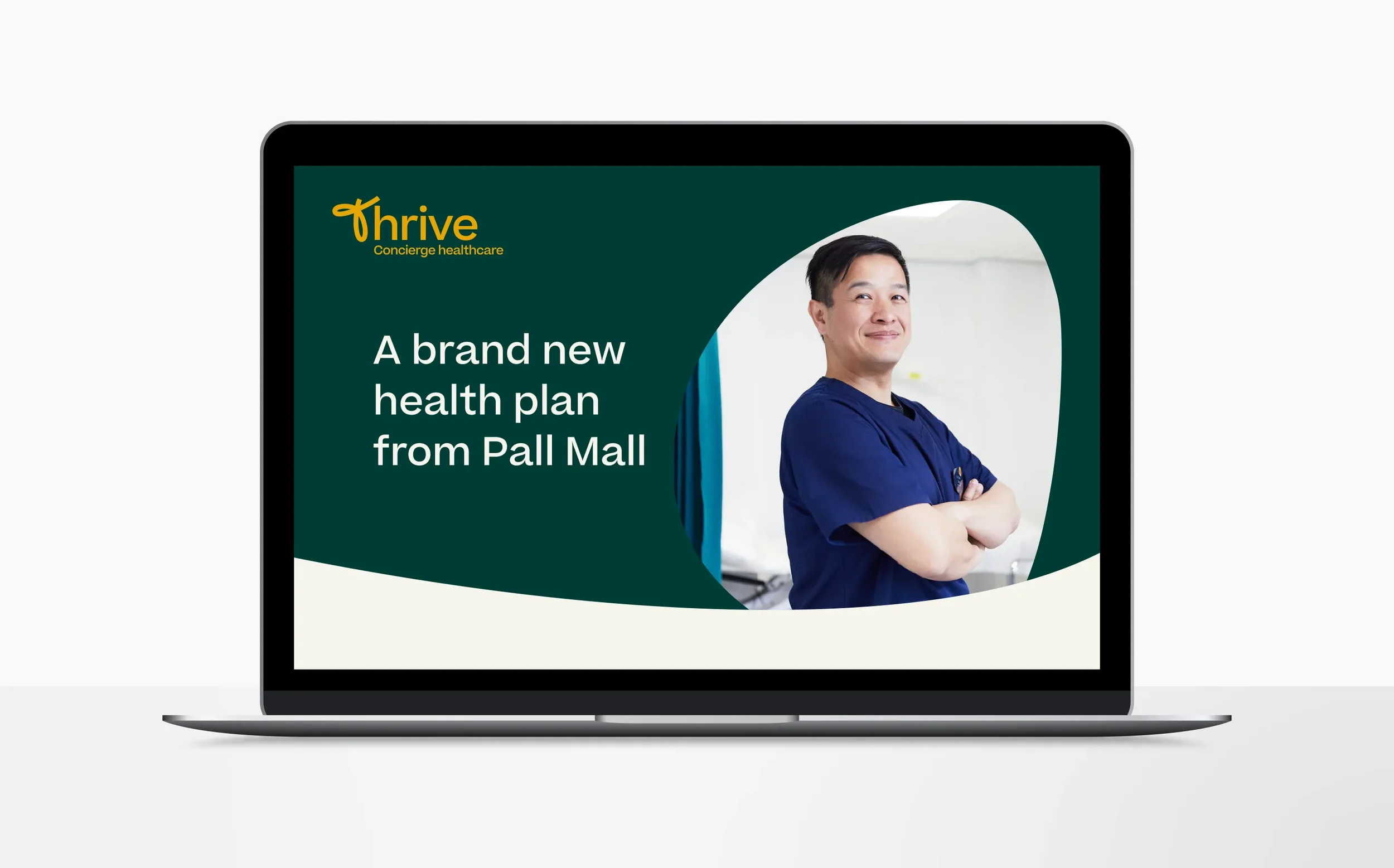
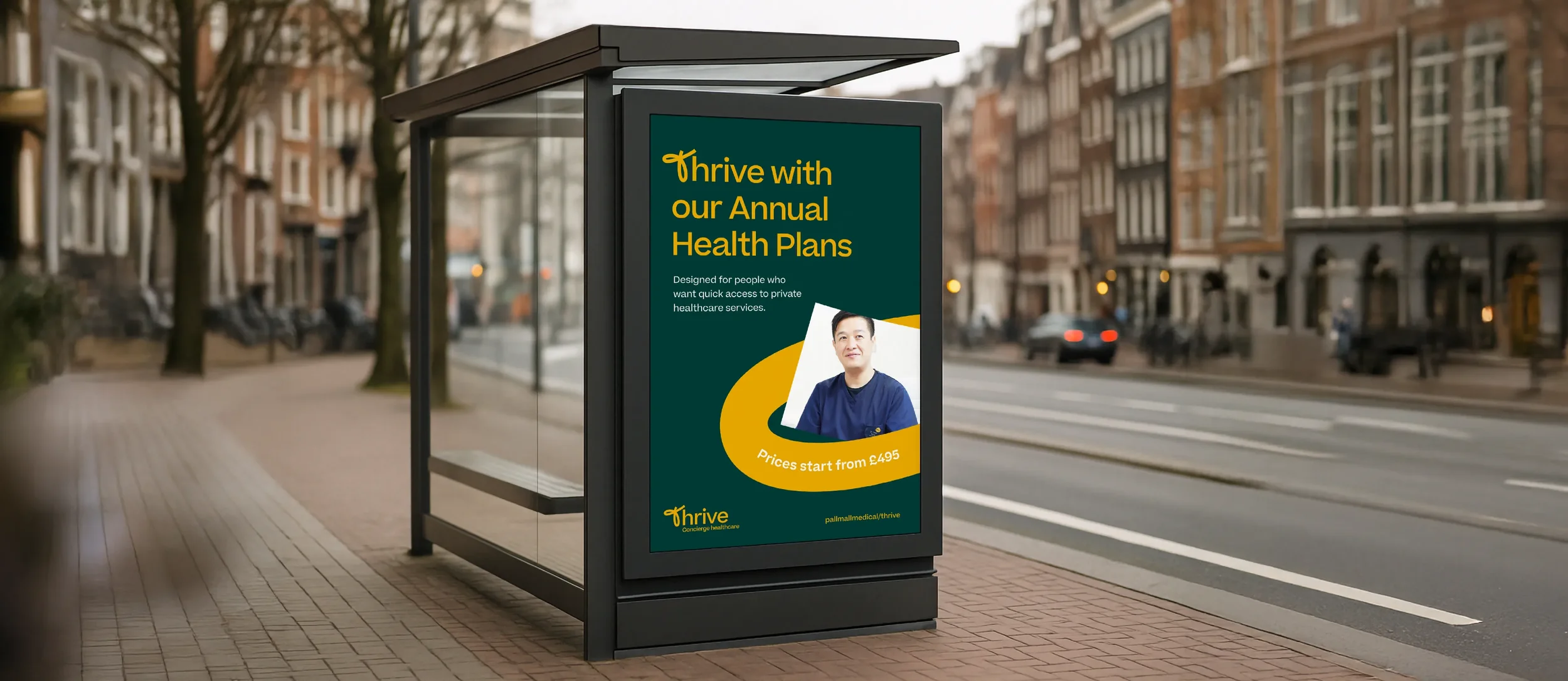
The new identity was brought to life across a dedicated microsite, brochure and supporting marketing collateral, creating a cohesive sub-brand that could explain a new kind of healthcare proposition simply and confidently.
The result is a brand that feels unmistakably connected to Pall Mall, but with an energy and personality entirely of its own. An identity designed not simply around healthcare, but around helping people get more from it.