PALL MALL PARTNERS

BETTER : TOGETHER
-
More than a facility. A partnership.
Pall Mall has long provided its state-of-the-art hospital, operating theatres and clinical facilities to independent surgeons, consultants and cosmetic surgery providers. But Pall Mall Partners was created to offer something more; combining those facilities with an enhanced level of service and support designed to help practitioners develop their own private practices. It was a shift from simply providing a service to building a mutually beneficial relationship. Partners. -
Changing the relationship.
Pall Mall had always generated a significant part of its business through independent surgeons and specialists using its hospital and clinics. The facilities were already of the highest standard, but following a review of the wider service it became clear there was an opportunity to offer considerably more.The change went beyond improving booking processes and support. Pall Mall wanted to fundamentally reposition its relationship with these clients, moving away from the transactional language of ‘third parties’ and instead recognising them as ‘partners’. The new Pall Mall Partners would not simply provide somewhere to practise, but actively support surgeons and consultants in growing their private patient numbers and practices.
Having already created the wider Pall Mall identity, we were tasked with developing a new sub-brand to communicate this change. It needed to be strong enough to stand alone, while remaining unmistakably part of Pall Mall. Professional, slick and credible, but importantly, human.
-
Partners by design.
Two creative routes were initially explored, with the chosen direction built around the very idea at the heart of the new proposition: partnership.‘Pall Mall’ and ‘Partners’ were brought together within a single wordmark, connected by a colon formed from two of the biomorphic shapes already established within the wider Pall Mall identity. The two forms coming together in perfect alignment became a simple visual representation of two parties working as one.
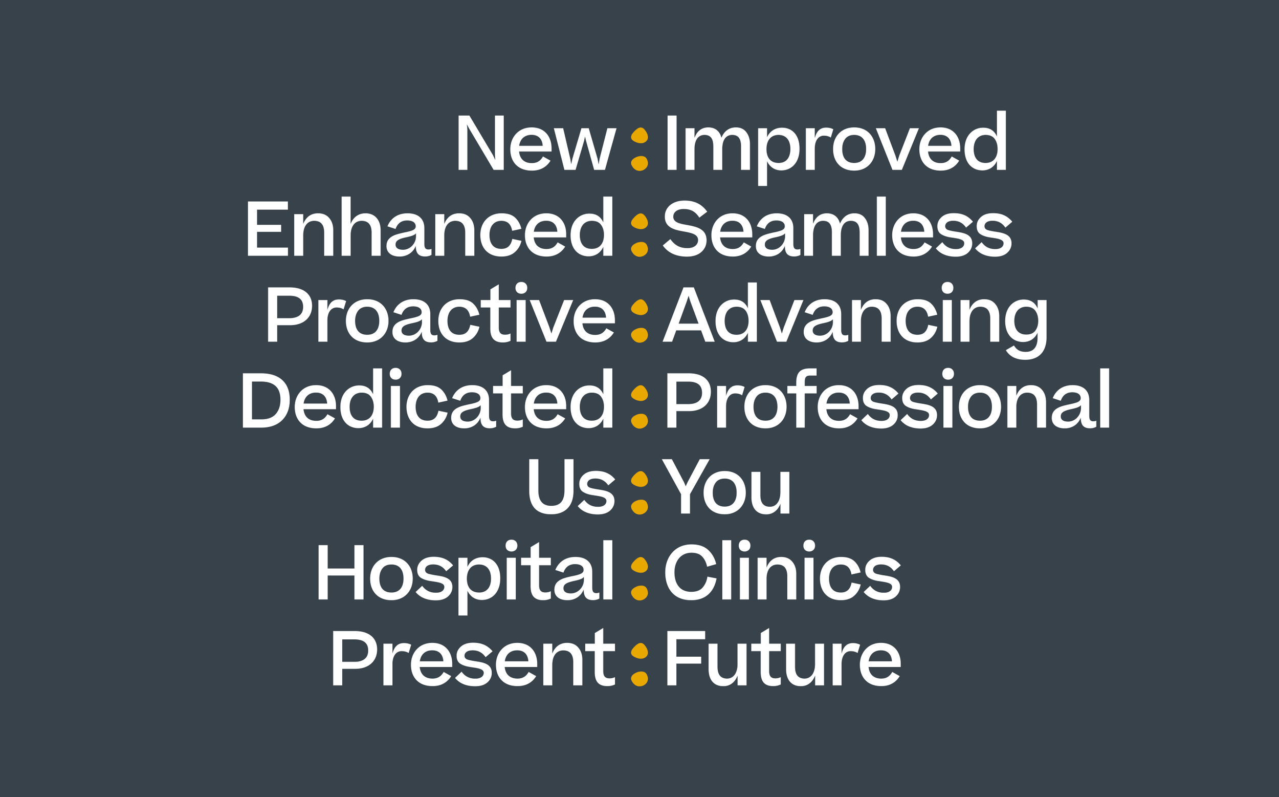
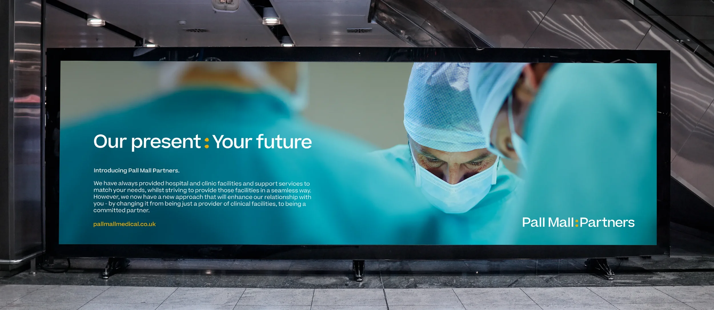
That colon became much more than a detail within the wordmark. We developed a system of two-word messaging around it, allowing the concept of partnership to run throughout the brand. examples such as ‘New : Improved’, ‘Dedicated : Professional’, and, perhaps most simply, ‘Us : You’, all reinforced the idea of two sides coming together, while providing Pall Mall Partners with a distinctive and flexible tone of voice.
Visually, we retained the core Pall Mall colour palette but changed its emphasis. Slate became the dominant colour, with Pall Mall’s primary mustard used more sparingly as an accent. The result was deliberately more corporate and sophisticated, reflecting an audience of established surgeons, consultants and medical professionals while retaining an immediate connection to the parent brand. Typography and imagery followed the same principle: professional and assured, without ever becoming cold or overly clinical.
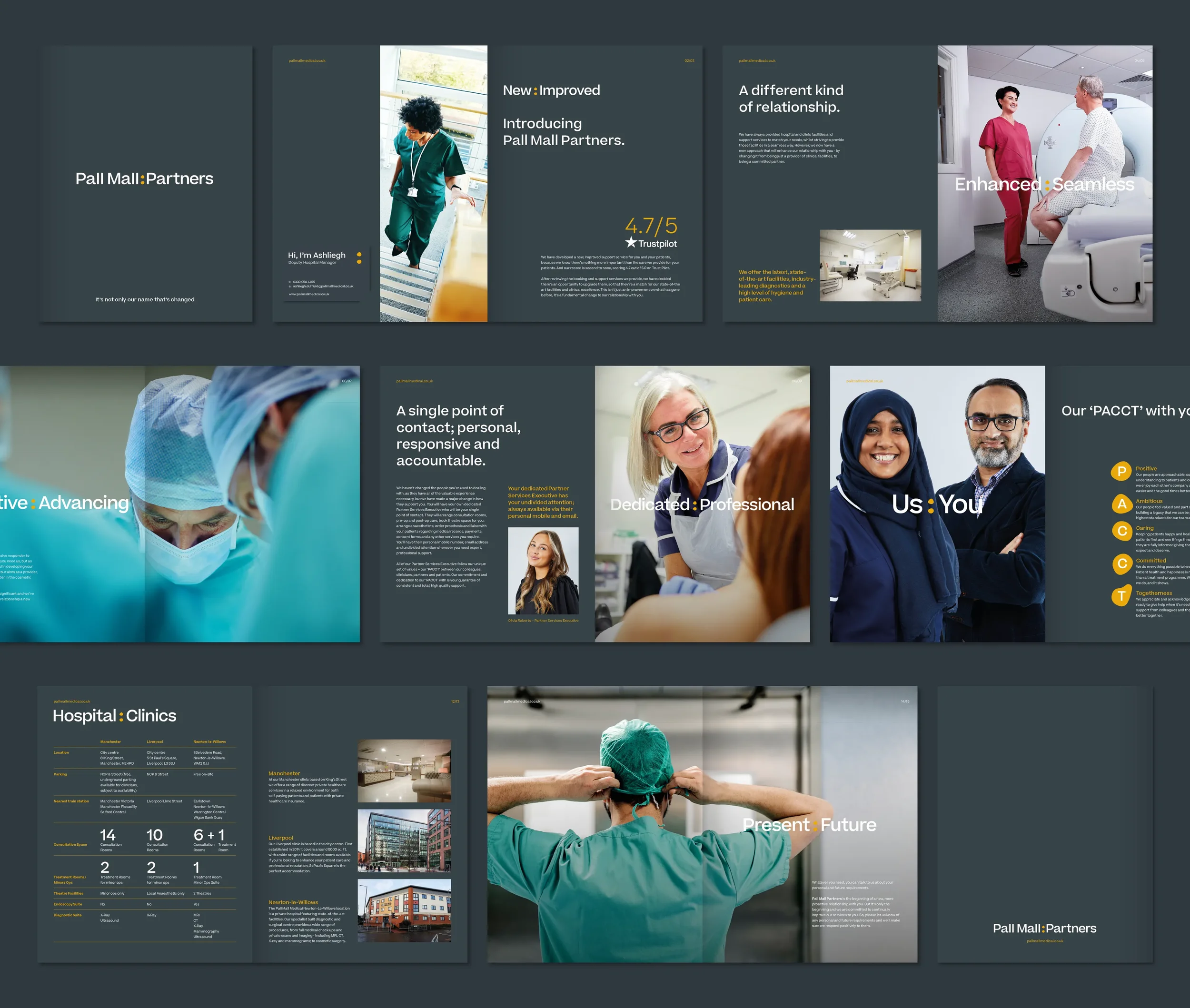
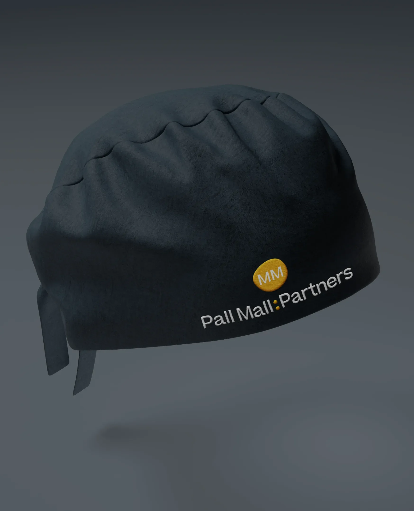
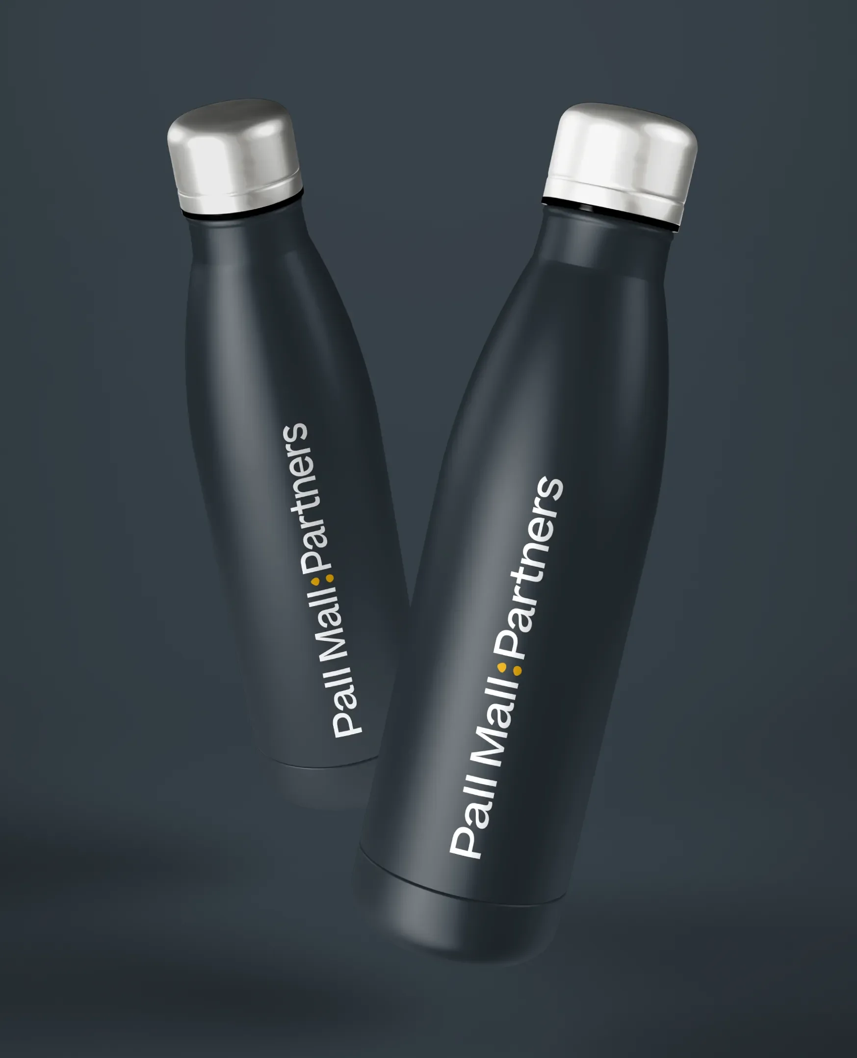
The identity was subsequently rolled out across a range of collateral, including a dedicated brochure and carefully considered touchpoints designed to enhance the partner experience. Branded water bottles, presentation gift boxes for new partners and even surgical caps personalised with individual surgeons’ initials all helped turn the new positioning into something tangible.
The result was a sub-brand that communicated a fundamental change in Pall Mall’s proposition while remaining intrinsically connected to the identity it came from. Not simply a new name for an existing service, but a visual and verbal expression of a new kind of relationship.