
THE ENGLISH WINE SHOP
English fizz in California? Really?
-
Establishing English wine in the last place you’d expect it
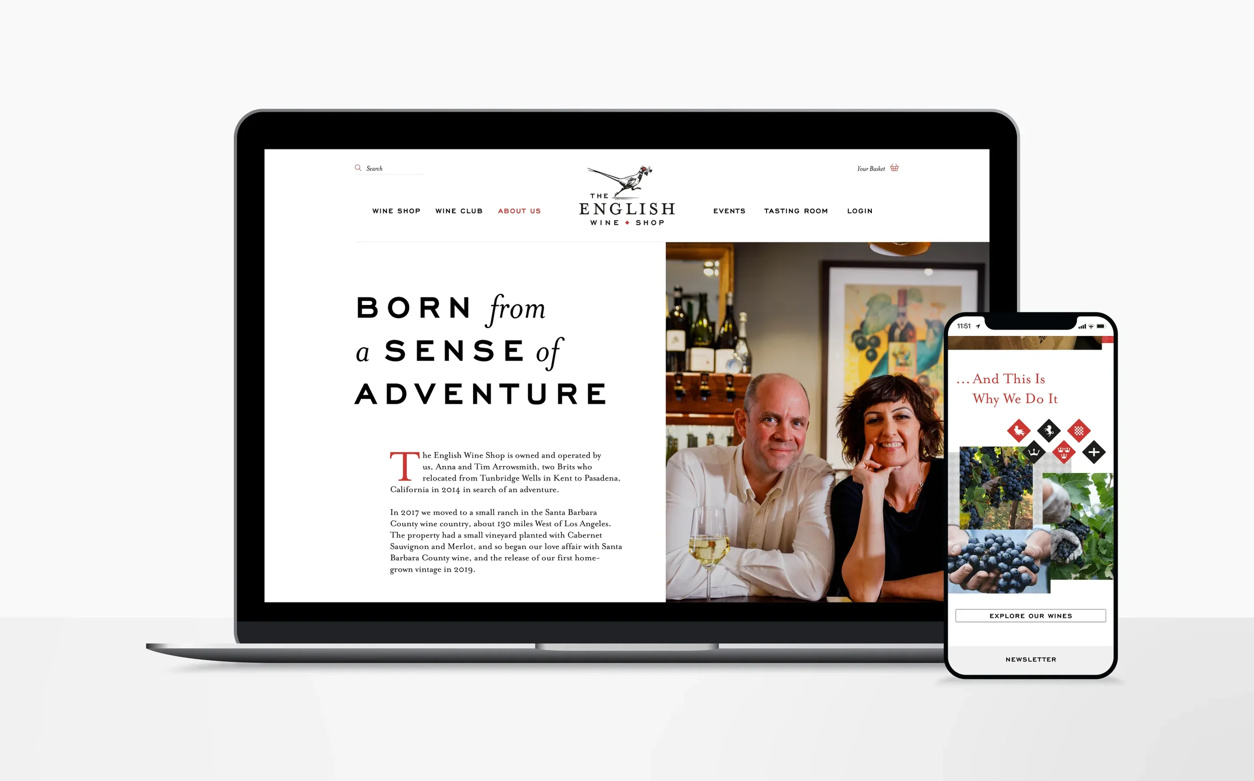
Solvang, California. An idyllic town situated in Santa Barbara county, deep in the heart of wine country. A place where you can expect to source the finest Pinot Noirs, Chardonnays and... sparkling English wine. But that’s exactly what Anna and Tim Arrowsmith, two British ex-pats, have done, launching the only wine retailer specialising in English wine on the west coast of the US. Unexpected. -
Becoming purveyors of quality
In such an established and respected corner of the wine world, persuading Californian connoisseurs to try something as unusual as English wine is no small challenge. To make things even more difficult, only 4% of British wine makes it off these shores (and almost half of that goes to Norway). But limited export numbers combined with a growing reputation = quality over quantity and the chance to showcase only the very best of British. -
A blend of the Old World with the New
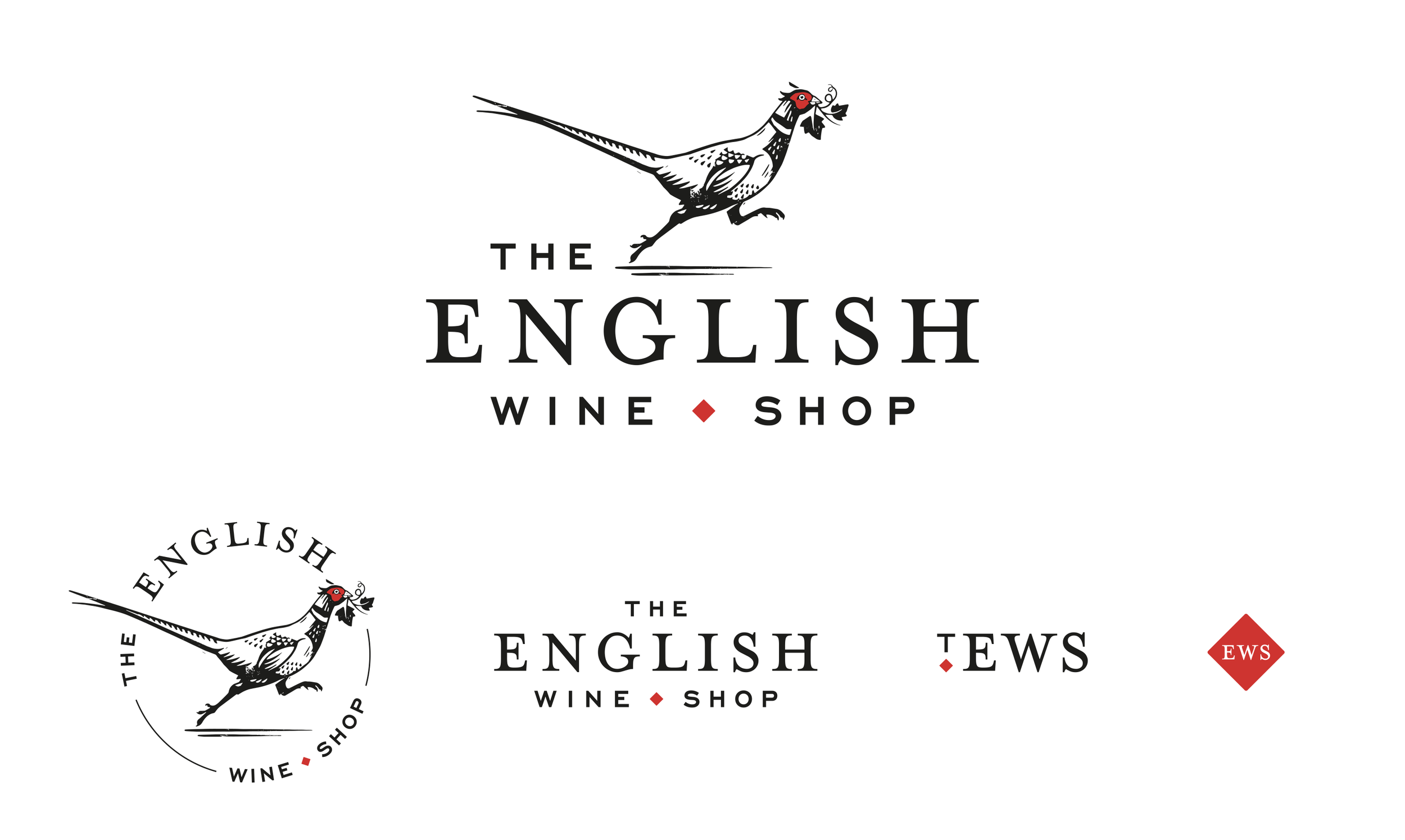
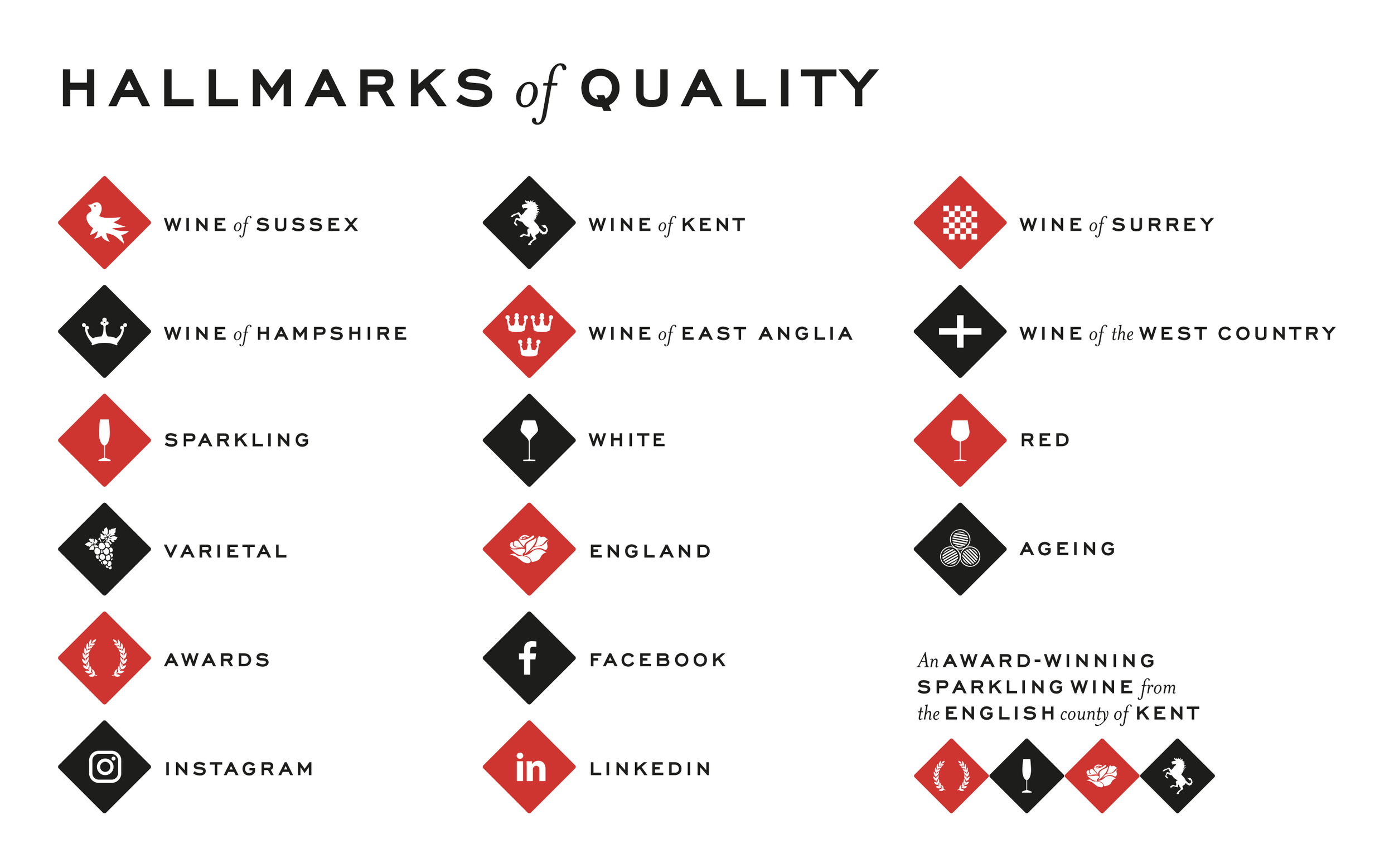
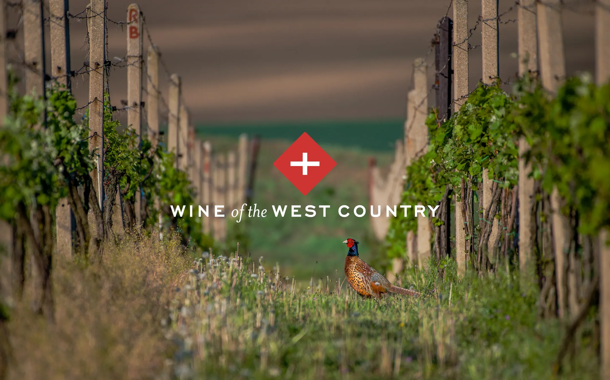
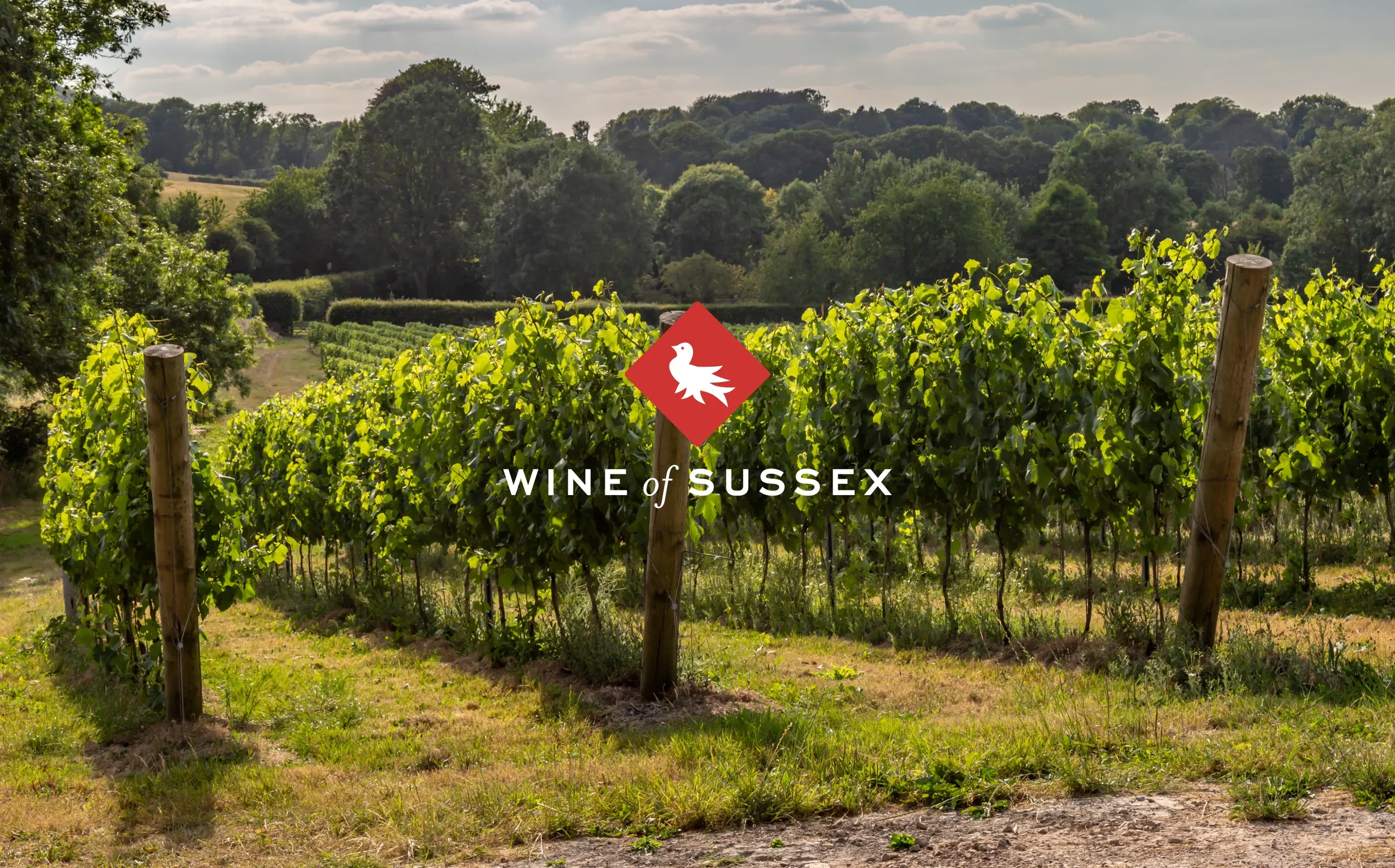
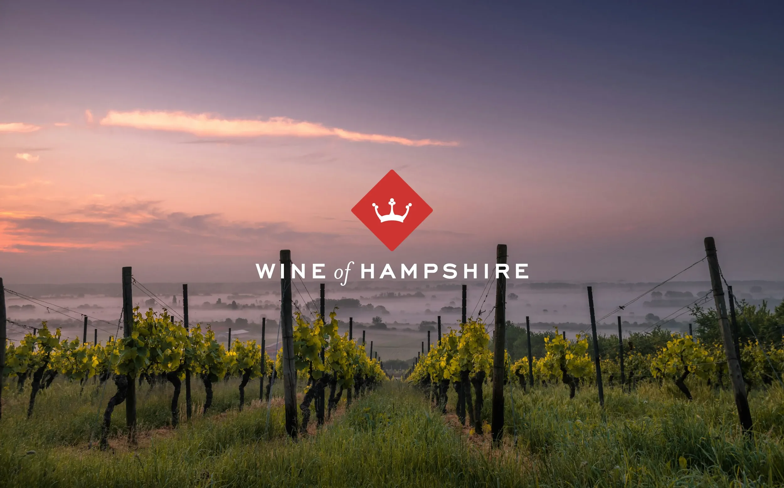
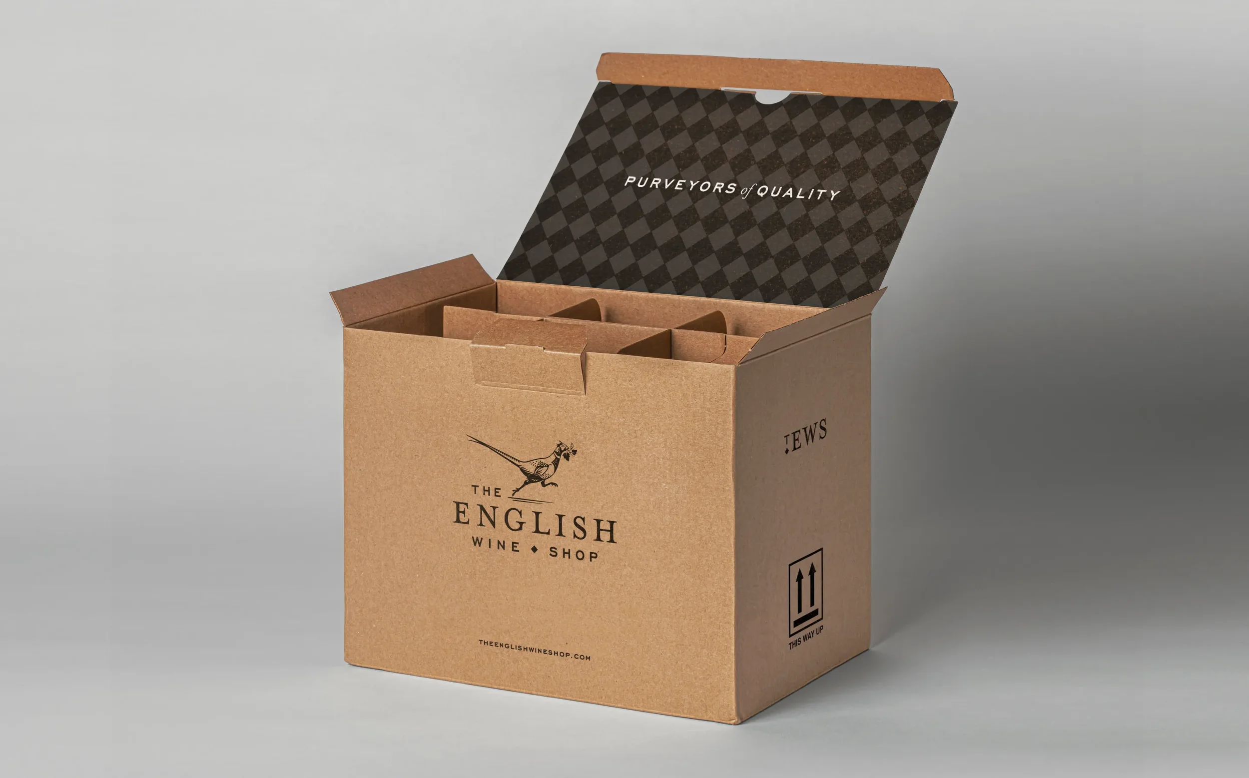
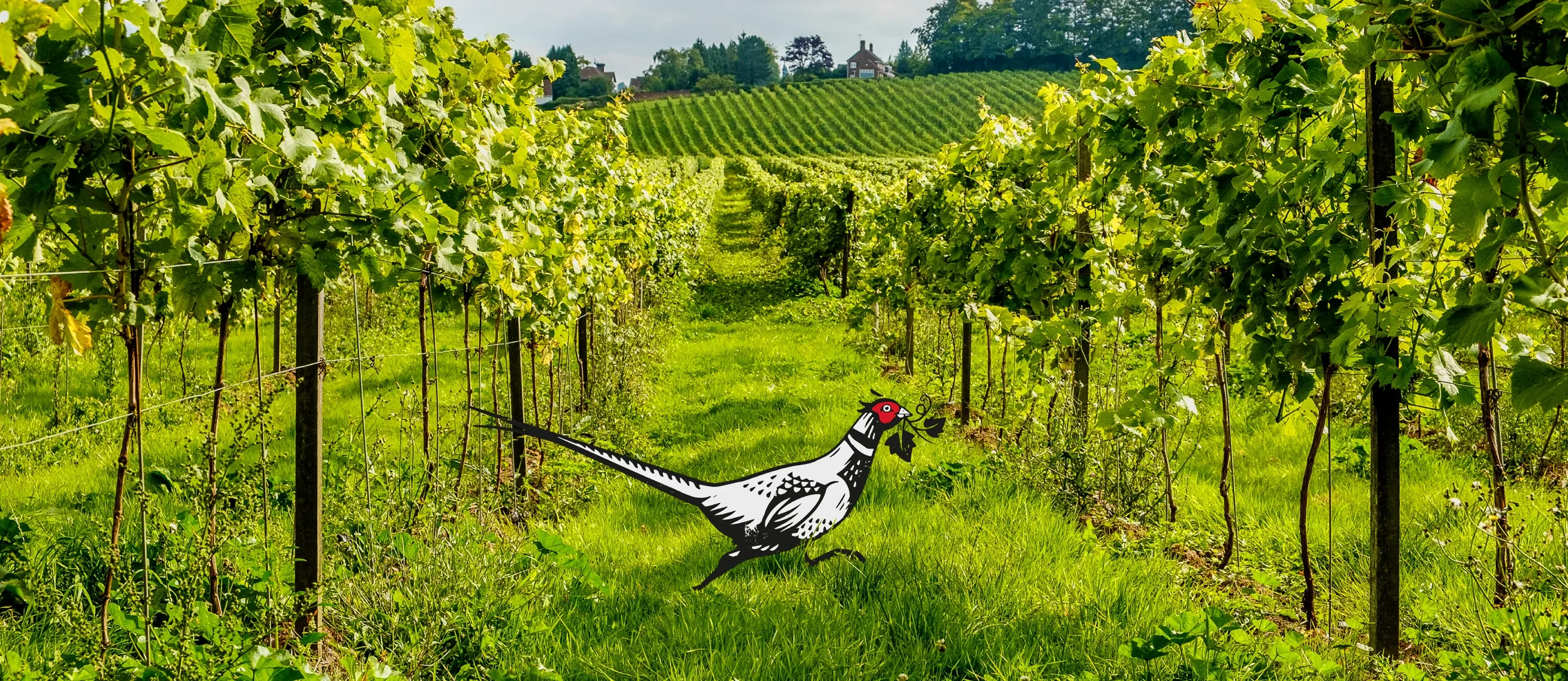
Storytelling and local knowledge go a long way in the wine industry, especially in California. As proprietors, Tim and Anna wanted to project an image of knowledgeable curators of a very select list of wines, passionate about their origins and first-hand knowledge of where the wines have come from. The brand identity and it’s accompanying website had to project a sense of Britishness without straying into thinly veiled nationalism of Union Jacks and the red, white and blue.Our focus settled on the southern English countryside that the vineyards inhabit to evoke a true sense of place. The ubiquitous ring-necked pheasant, found in all corners of England’s green and pleasant land, was the perfect personification of the brand. By pairing our new mascot with two classical fonts, a brand identity was created that suggests excellence, authority and trustworthiness. We created a deliberately restricted colour palette of red, black and white, to both hark back to it’s English origins as well keeping the overall look and feel clean and contemporary, mixing the old with the new. A sense of modern heritage was also the basis for the brand’s visual system. Inspired by hallmarks, the iconography is clean and simple, but evokes a sense of quality and trustworthiness.
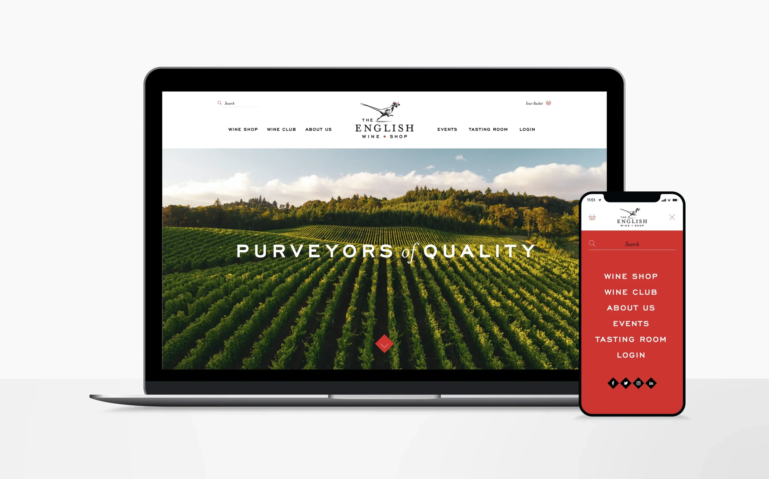
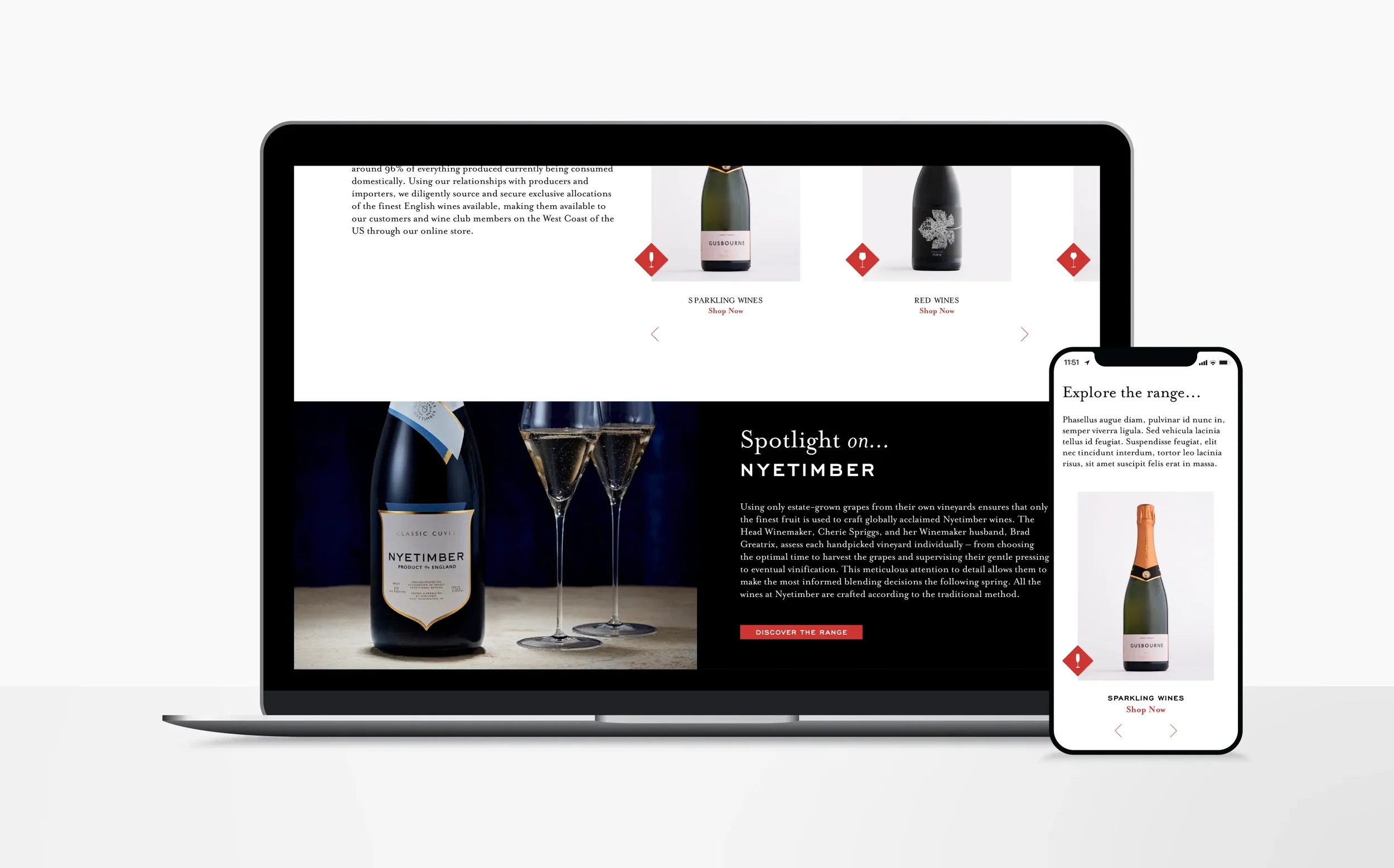
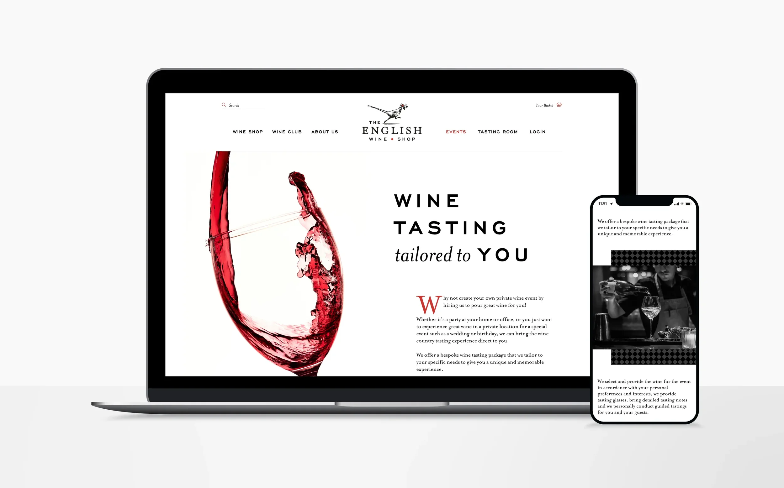
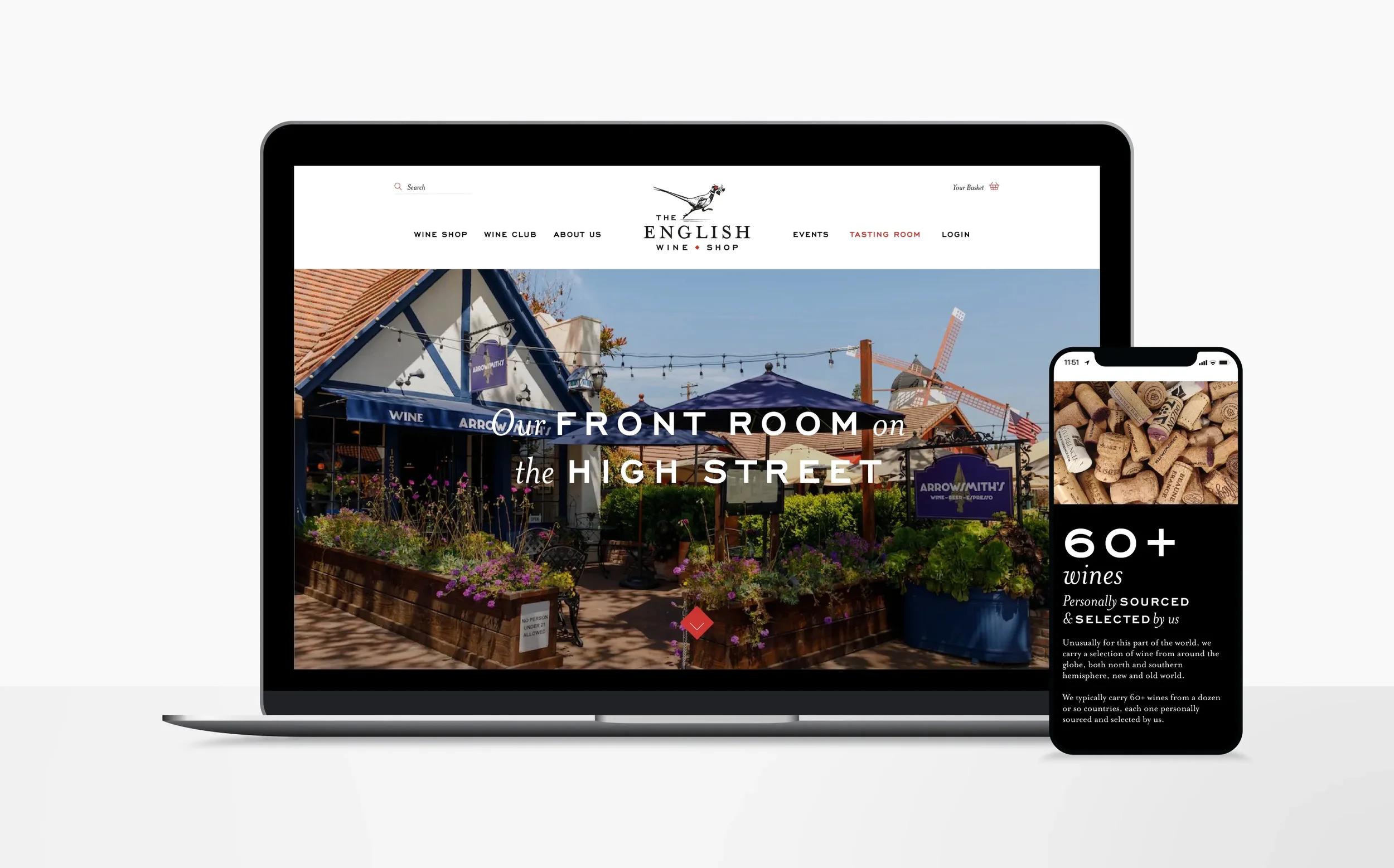
The most prominent vehicle for the brand was its e-commerce website. Minimalism and white space was called for, bringing modernity and allowing the product itself to do most of the hard work. Additionally, owning their own wine bar in Solvang allows Tim and Anna the opportunity to not only market their new venture to their customers, but a space to also promote the bar and their ever popular wine club. When brought together, the website and new brand identity has given the Arrowsmith’s the best chance to establish a firm foothold in a very competitive and established market.
-
– Illustration: Simon Henshaw

"WE HAVE WORKED WITH ABOVE & BEYOND SINCE 2019, ACROSS FOUR OF OUR BUSINESSES, AND THEY CONCEIVED THE ENTIRE IDENTITY OF THE ENGLISH WINE SHOP, FROM THE LOGO TO THE ENGLISHWINESHOP.COM WEBSITE AND THE PACKAGING. WE WORKED THROUGH THE DESIGNS TOGETHER; THEY WERE RECEPTIVE TO OUR FEEDBACK AND BUILT IT INTO EACH CONCEPT, AND THEY WERE COMMUNICATIVE AND RESPONSIVE THROUGHOUT. THEY HAVE AN UNCANNY UNDERSTANDING OF WHAT WILL WORK IN EACH APPLICATION, WHETHER THAT IS A BOX, A LABEL OR A WEB PAGE. I WAS DELIGHTED WITH THE WHOLE PROCESS. ABOVE & BEYOND COMBINE REAL TALENT WITH BEING GENUINELY NICE TO WORK WITH, AND I RECOMMEND THEM WITHOUT HESITATION TO ANYONE BUILDING A BRAND FROM NOTHING."
Tim Arrowsmith, The English Wine Shop