BUCKINGHAMSHIRE BUILDING SOCIETY
BUILDING A BRAND FROM CENTURY-OLD FOUNDATIONS
-
A building society based on local values
Founded in Chalfont St Giles in 1907, Buckinghamshire Building Society is a member-owned mutual with more than a century of history behind it. Serving members primarily across Buckinghamshire and the other Home Counties, the Society provides a range of savings and mortgage products, with a strong connection to its Bucks roots. Established. -
From a logo to a brand
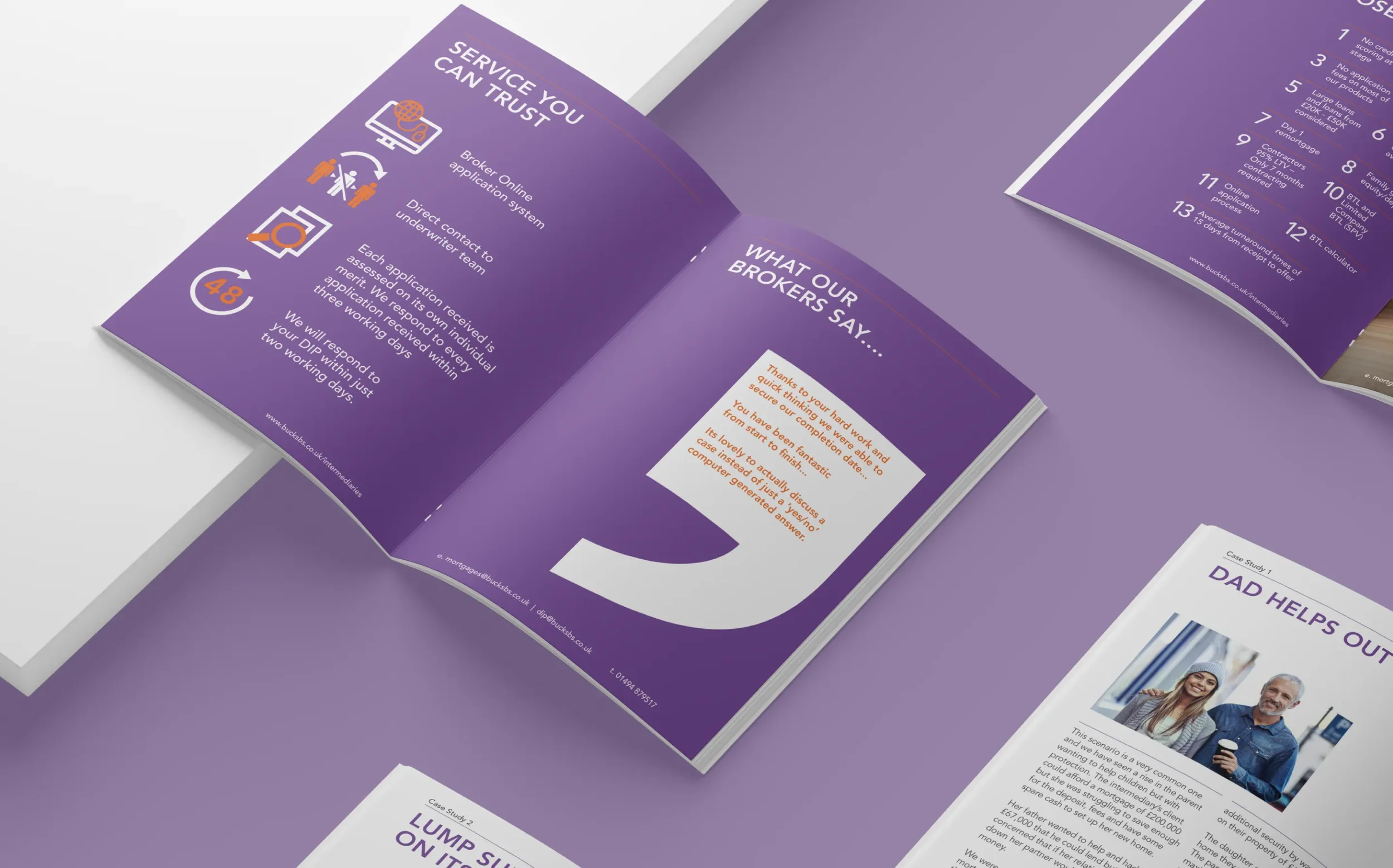
Our relationship with Buckinghamshire Building Society began with a relatively straightforward project: an eight-page mortgage brochure. At the time, the Society had a recognisable logo and a loose colour palette derived from it, but its marketing materials had developed in a largely ad-hoc way, with little consistency from one piece of communication to the next.As the relationship developed and the volume of work increased, it quickly became an opportunity to bring some much-needed cohesion to the brand without fundamentally changing what was already there. The challenge was to evolve the existing identity rather than replace it, creating a more structured and professional approach that could be applied consistently across everything the Society produced.
-
Evolution, not revolution
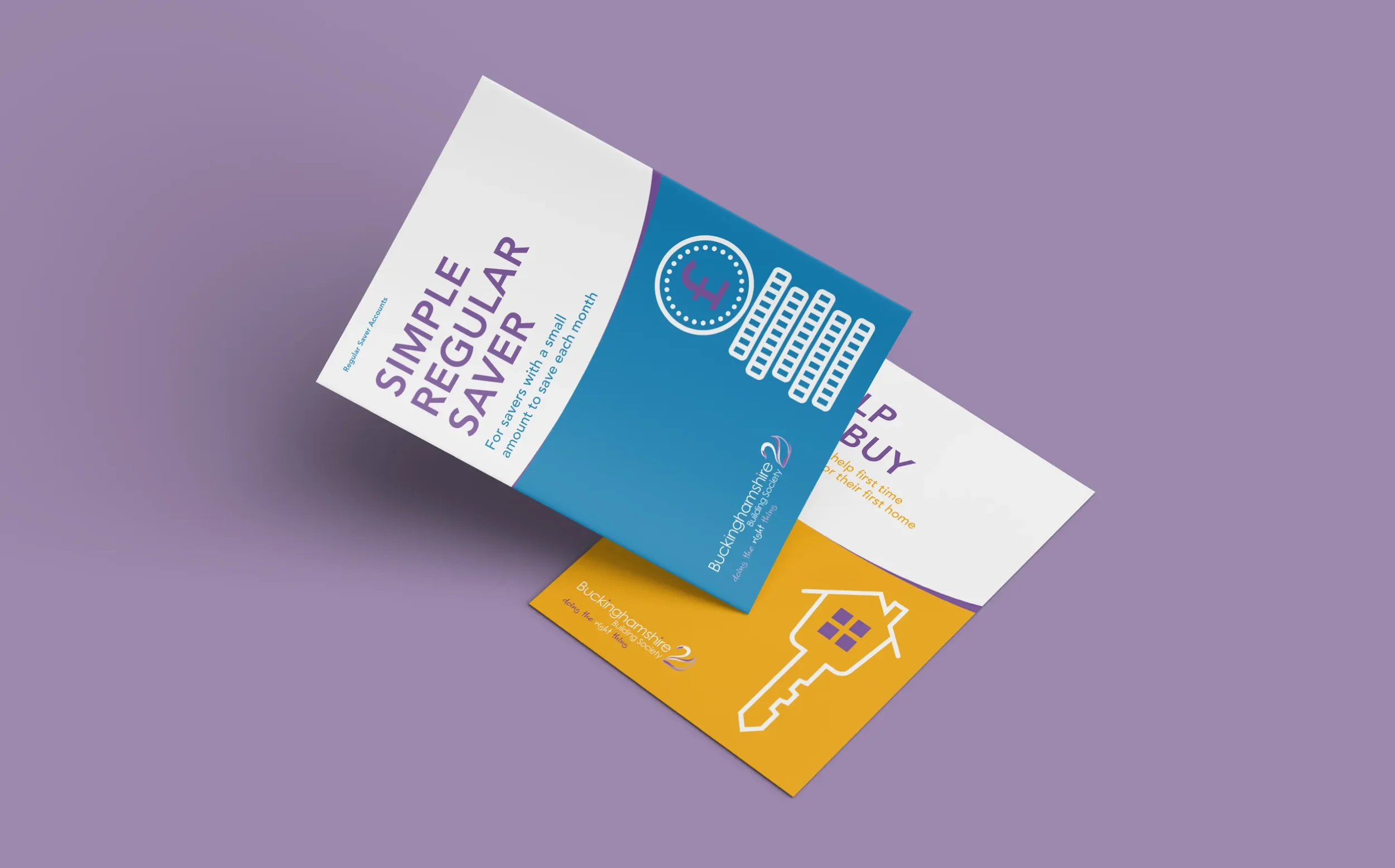
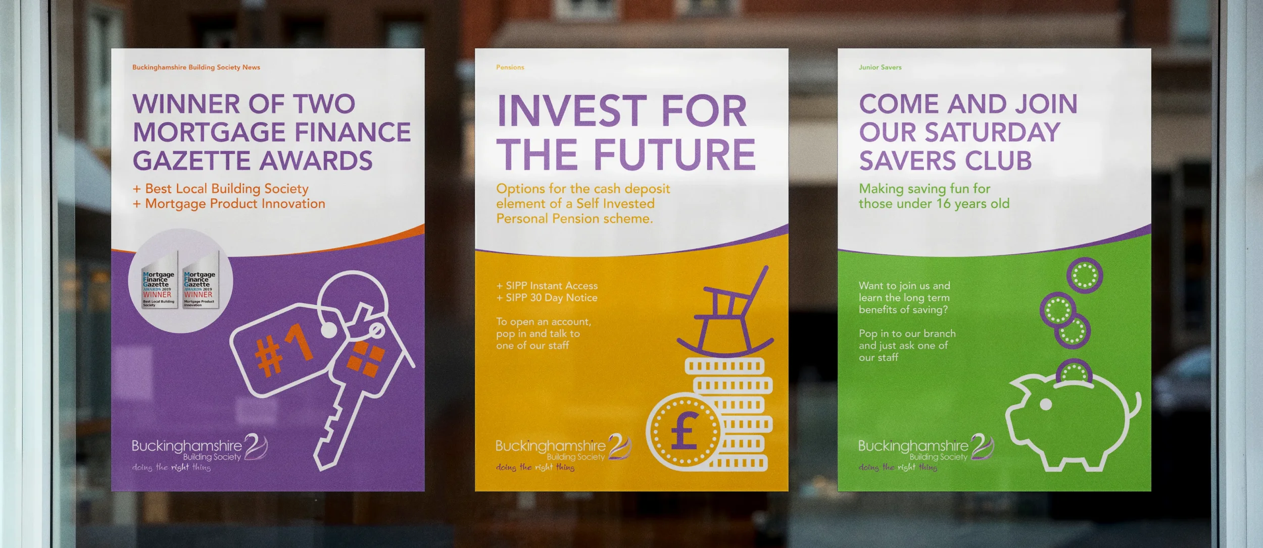
We began by taking what Buckinghamshire Building Society already had and building upon it. The existing logo remained at the heart of the identity, but a more considered visual system was developed around it. A structured primary colour palette was established using colours drawn from the existing brand, alongside a complementary secondary palette that could be used to differentiate the Society’s various services and communications.Typography was also formalised, with clear rules around corporate fonts, hierarchy and application. This gave everything from a small leaflet to a larger brochure a consistent typographical structure, while making the information easier to navigate and understand.
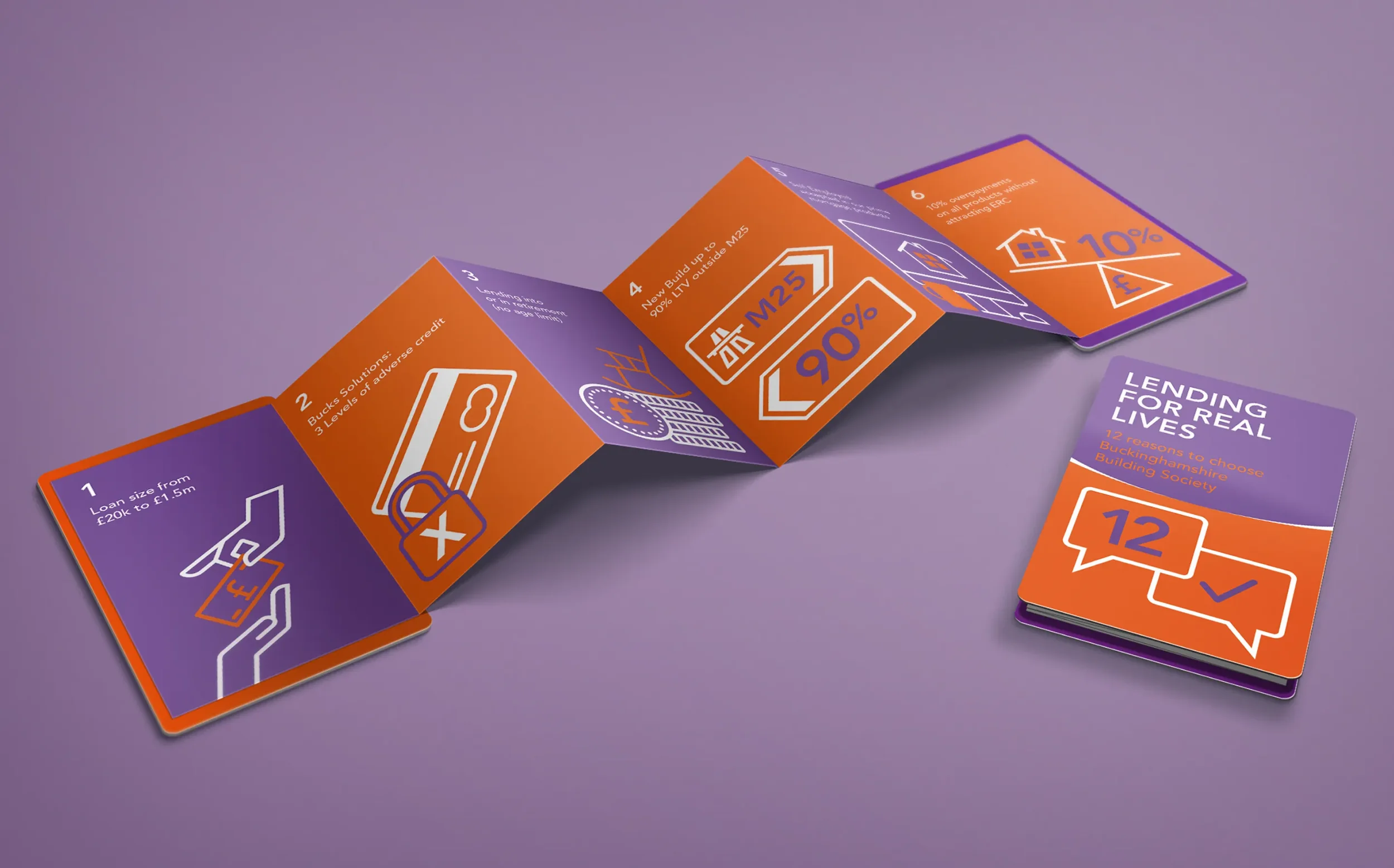
To add a little more character to the brand, we introduced a linear illustration style that complemented the existing identity without overwhelming it. A full suite of icons was also developed, giving the Society a flexible visual language that could be used across its marketing communications.
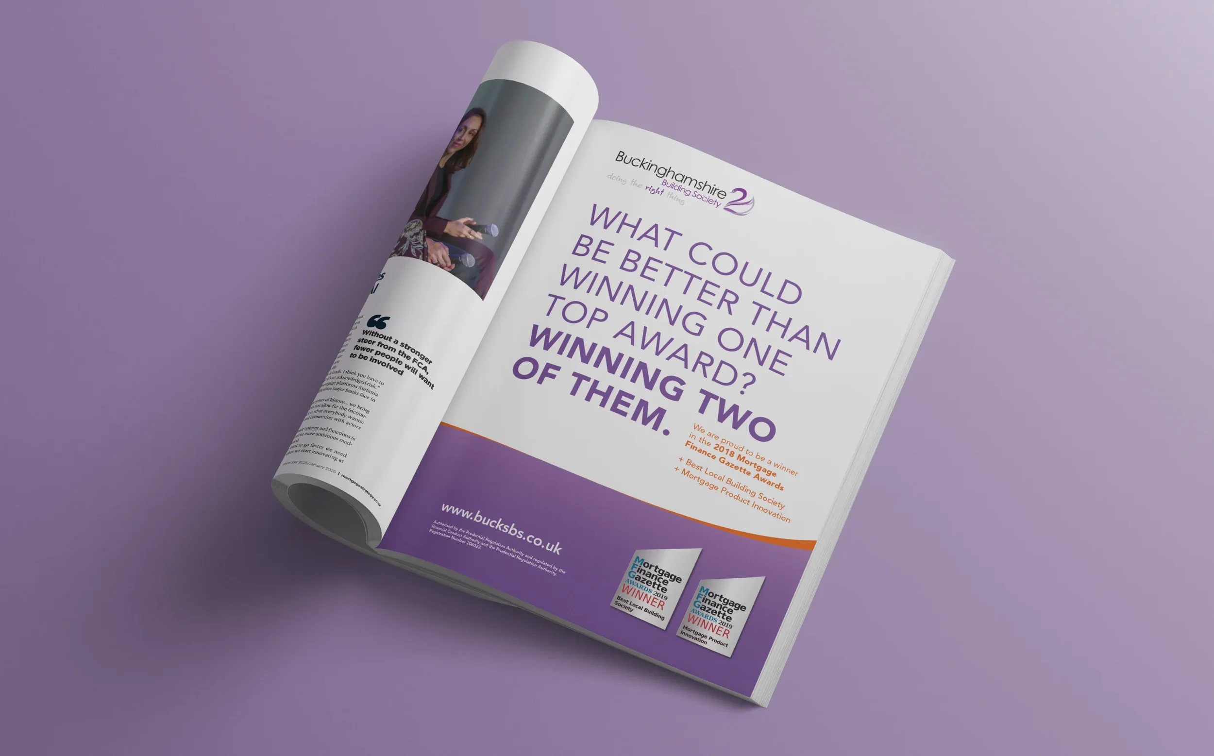
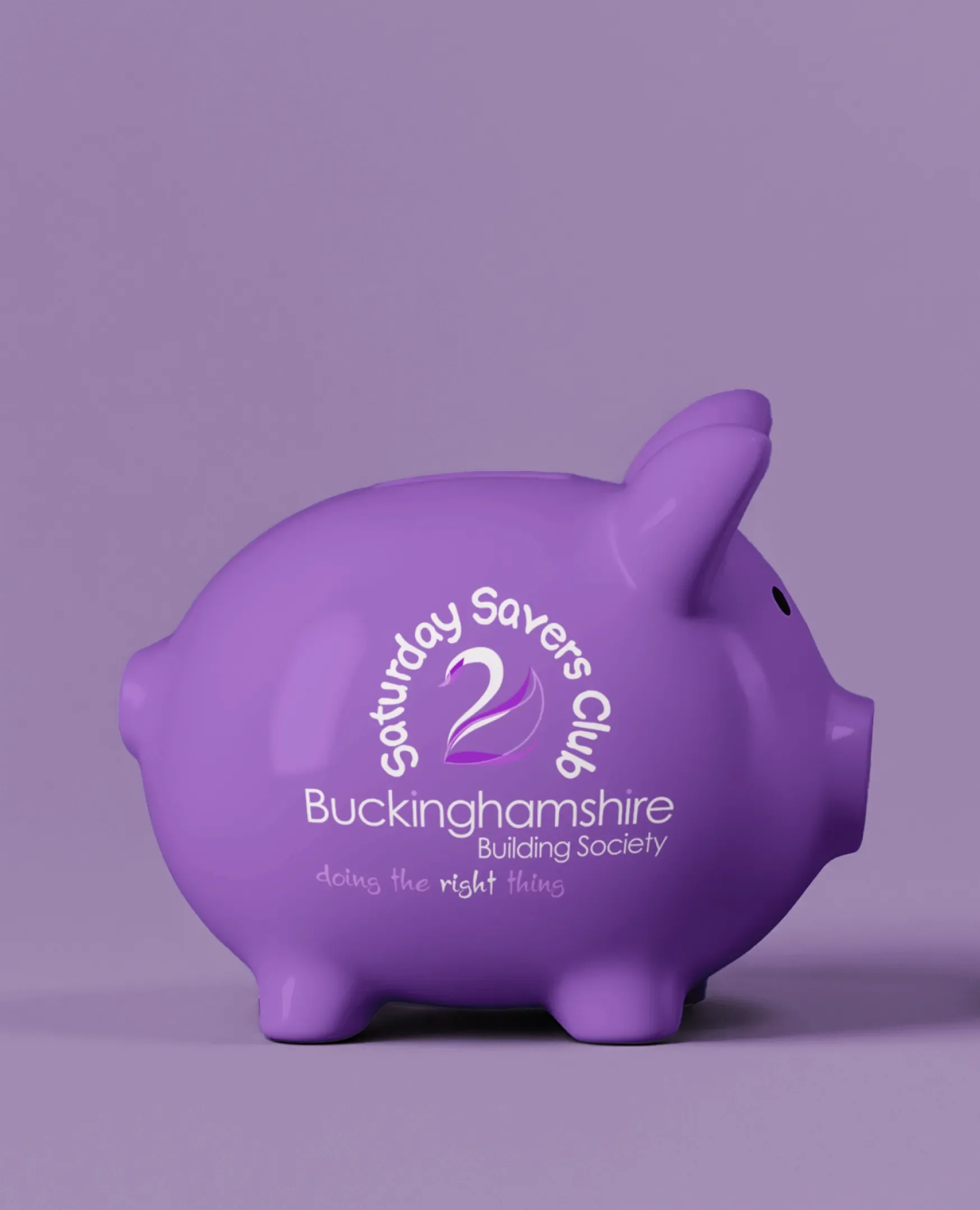
As the relationship developed, we also looked beyond the conventional formats the Society had previously used. Alongside brochures, leaflets, posters and print advertising, we produced a range of more unusual formats including z-fold pocket guides, fold-out mailers that extended from A5 to A2, and branded merchandise including mugs, pens and even piggy banks. Each provided an opportunity to demonstrate how the evolving identity could work in different ways while remaining recognisably Buckinghamshire Building Society.
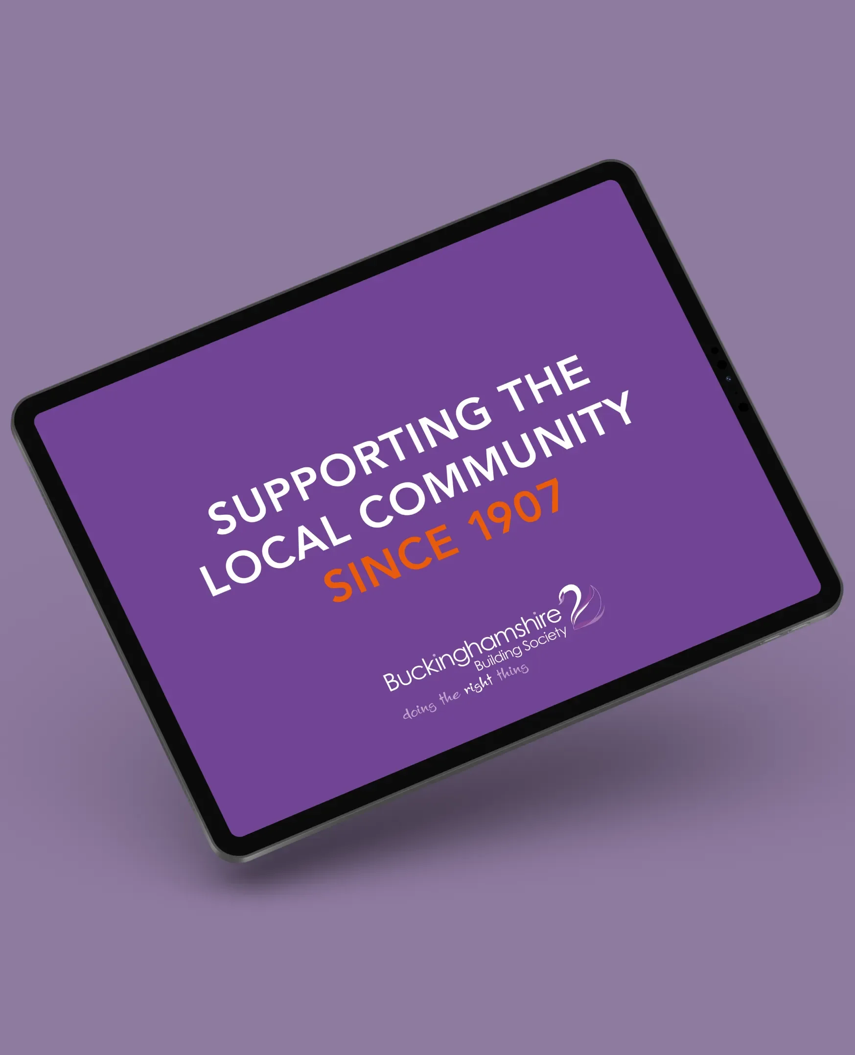
The result was a significant step forward from simply having ‘a logo’ to having a genuine brand identity. Across its marketing literature and in-branch communications, everything now felt considered, consistent and recognisably part of the same brand. It was evolution rather than revolution, but sometimes making the most of what you already have can make all the difference.