
ARROWSMITH WINERY
A FRUITFUL RELATIONSHIP
-
From California, with love
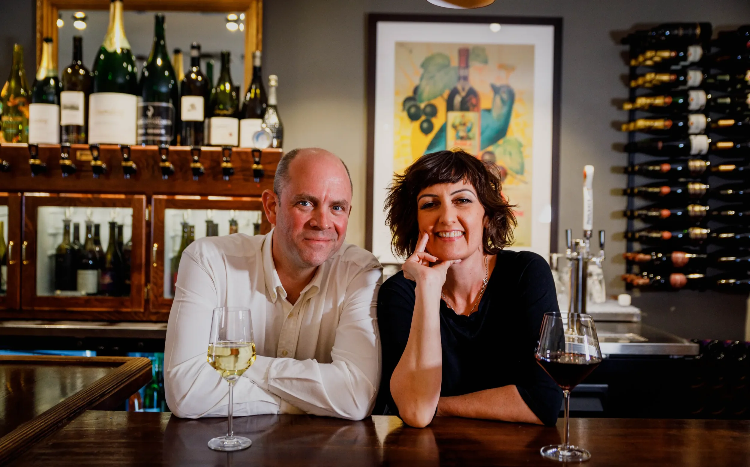
Behind Arrowsmith are Tim and Anna Arrowsmith, two British expats who swapped the UK for California and have since turned their hands to everything from growing grapes and producing wine to running their own bar in Solvang. Our relationship with them has been equally varied, spanning wine labels, websites, menus, event calendars, stationery and plenty more besides. Eclectic. -
A little bit of everything
Our relationship with Arrowsmith began with their Californian wines, initially providing ongoing creative support across their established range of labels. Before long, what started with the occasional update developed into a much broader relationship, encompassing everything from their wine business and former Solvang bar to entirely new ventures.There has never really been one Arrowsmith brief. Instead, we’ve become a trusted creative partner whenever something new is required. Sometimes that means working sympathetically within an established identity; with others, it means being given little more than an idea and the freedom to create something entirely new. The challenge is knowing when to do which.
-
Variety is the spice of life
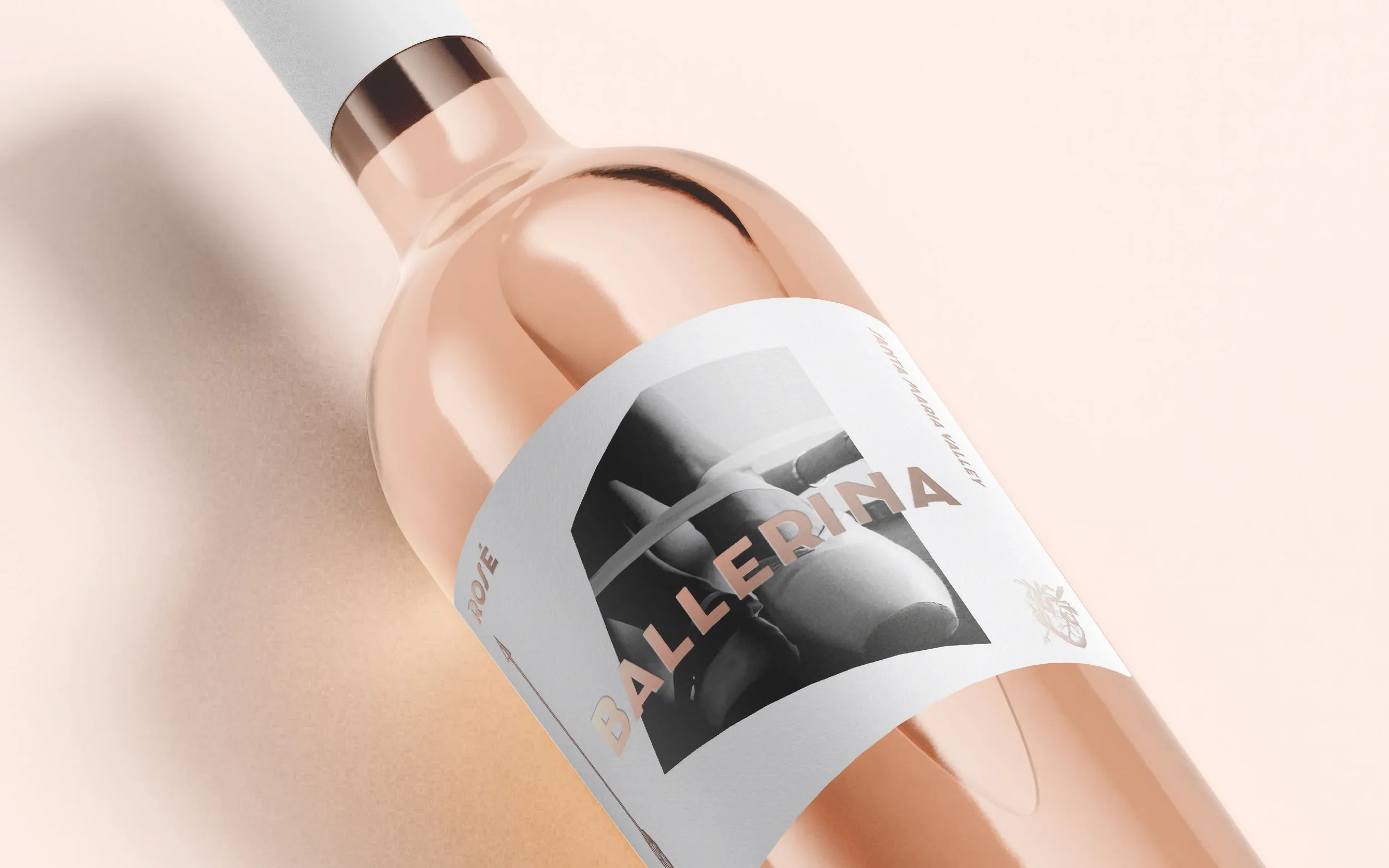
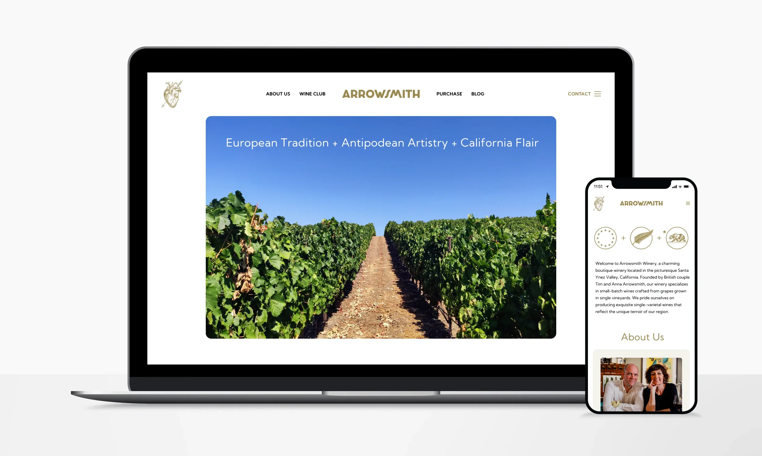
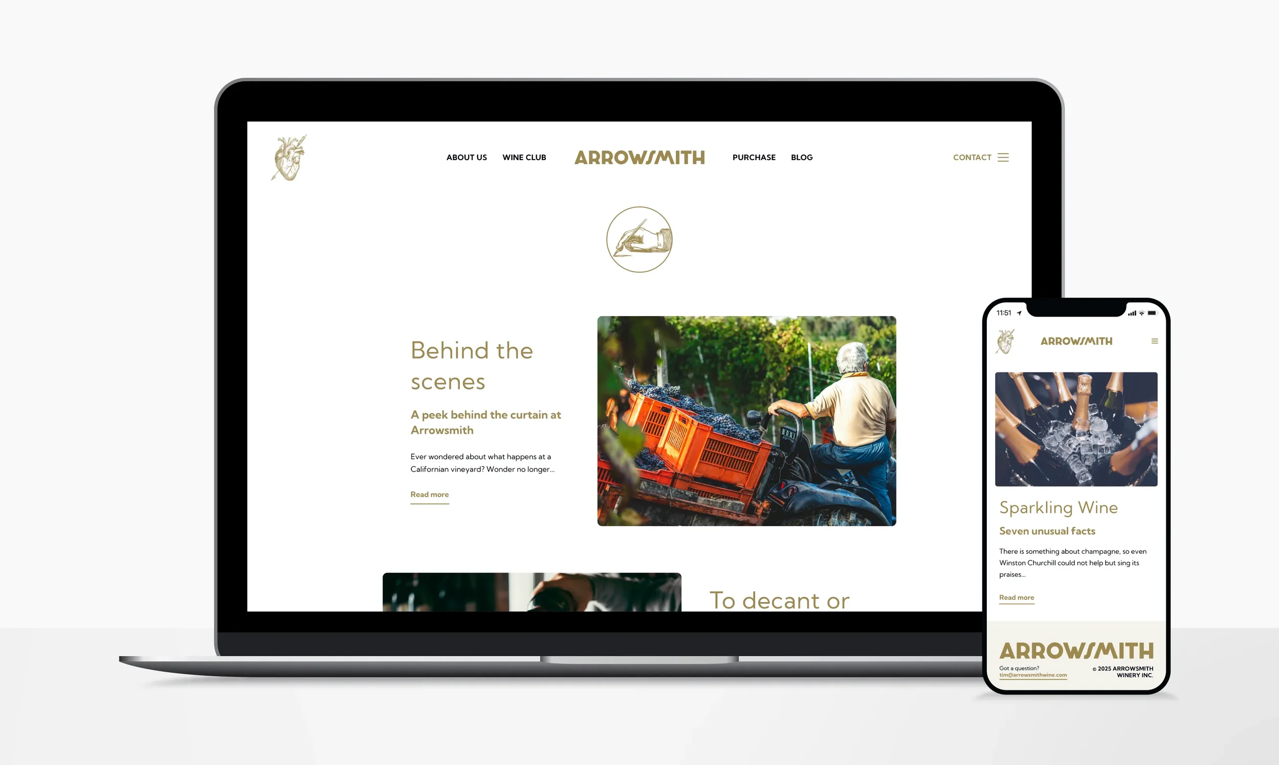
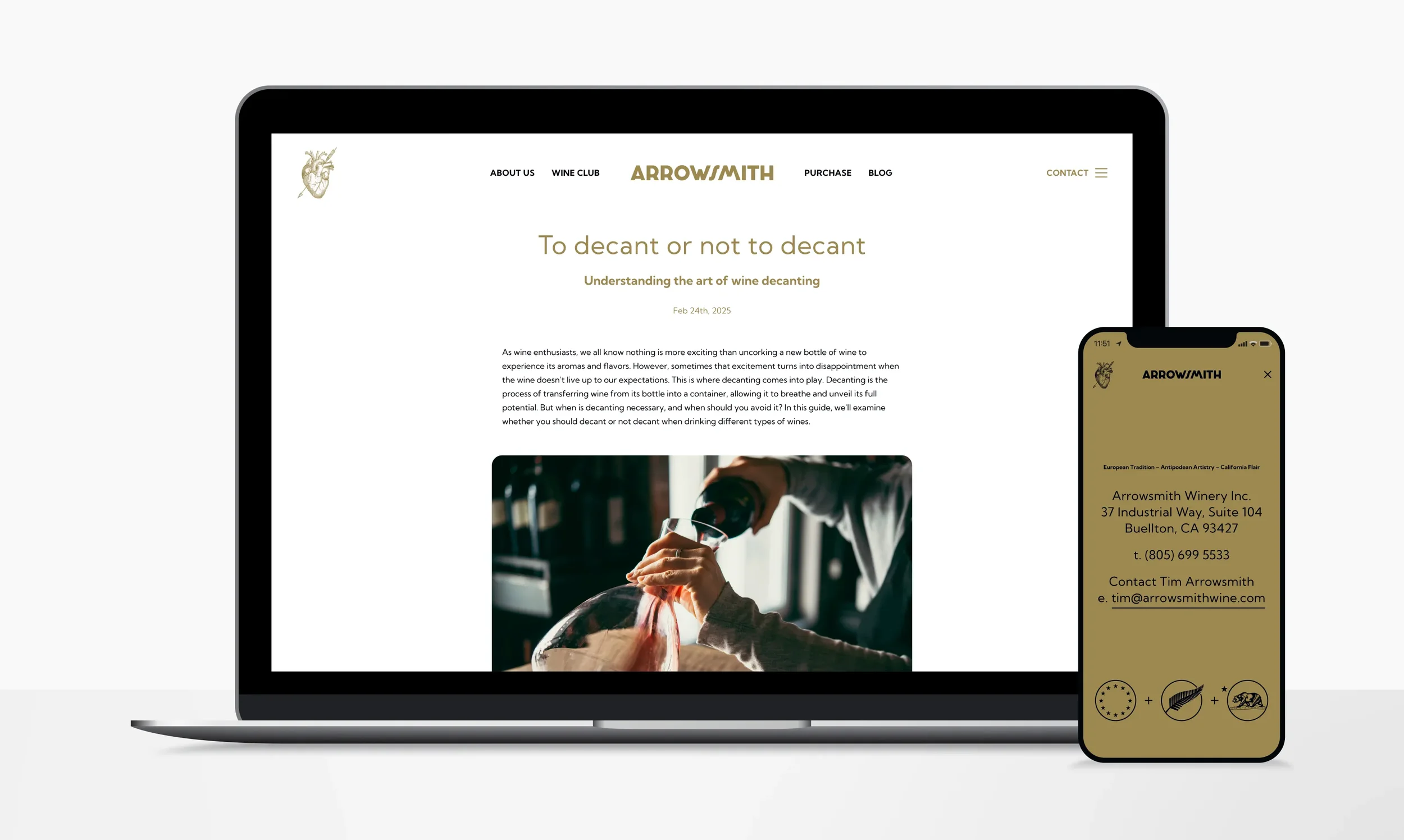
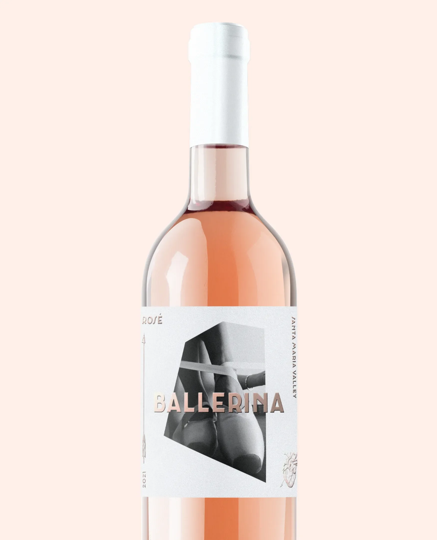
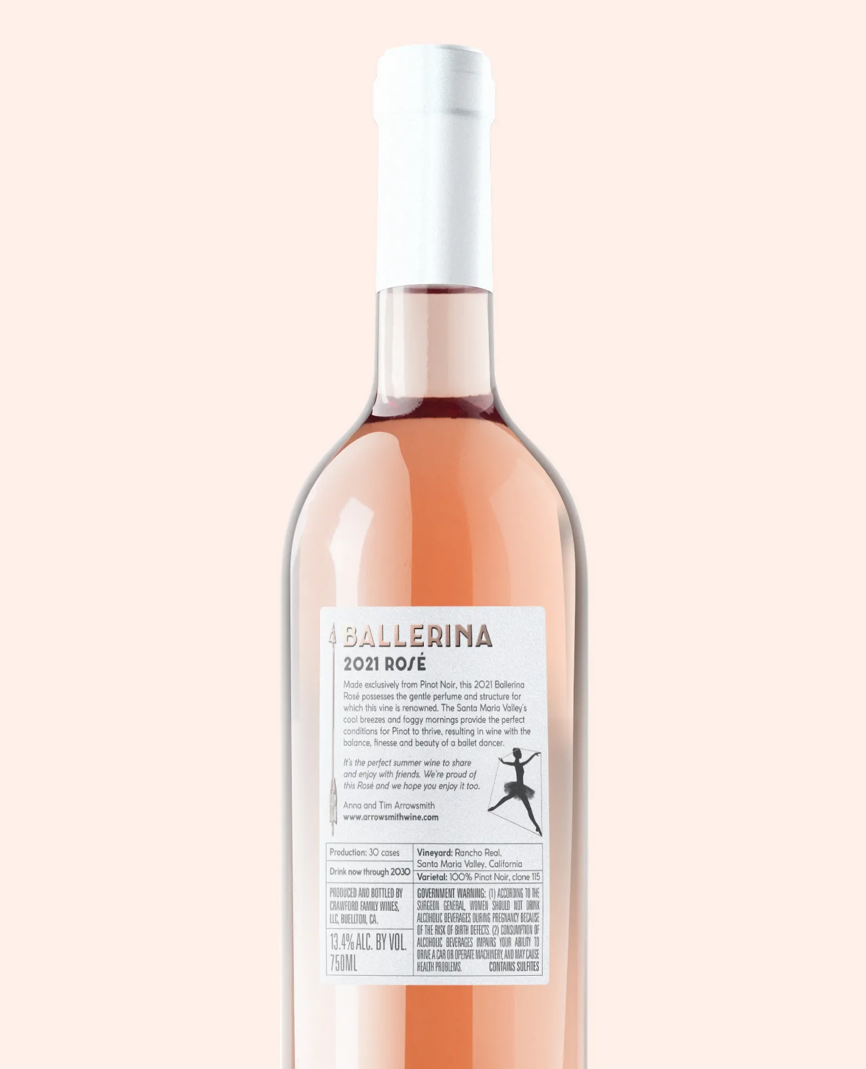
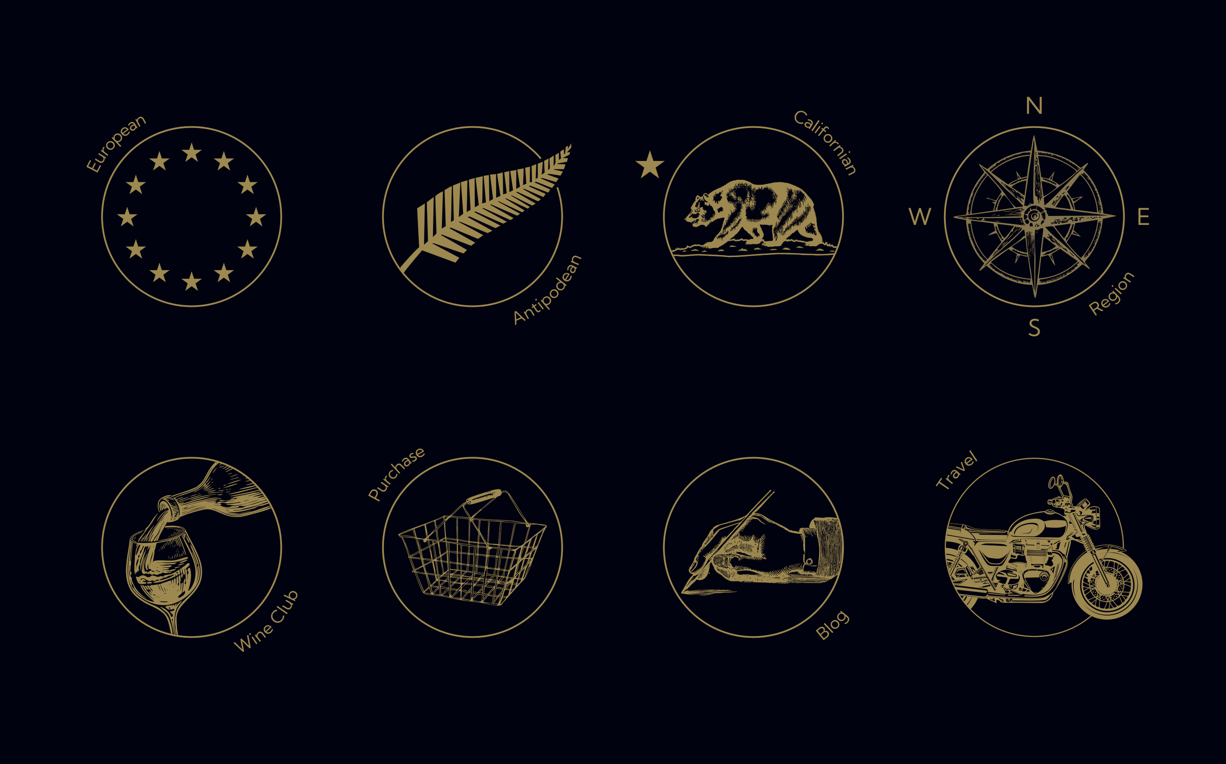
Perhaps the best example of the latter is Ballerina, a Rosé that deliberately broke away from the established Arrowsmith label system. Tim and Anna wanted something entirely different for the new wine, supplying only an image of a ballerina’s feet as the starting point. A number of creative routes were explored before settling on a design that placed the monochrome image within a flowing form inspired by the movement of a dancer. Rose gold foil was used for the name and supporting details, adding warmth and elegance while giving the finished label a suitably premium feel. Dynamic, distinctive and entirely its own.Our work for Arrowsmith Wine has also extended into digital. When Tim asked us to redesign the vineyard website, the brief was refreshingly straightforward: keep it light and airy. We did exactly that. Rather than over-designing the experience, we created a clean, contemporary site that allowed the wine, vineyard and story behind them to take centre stage. A bespoke suite of iconography was developed alongside it, adding character that complemented the simplicity of the wider design.
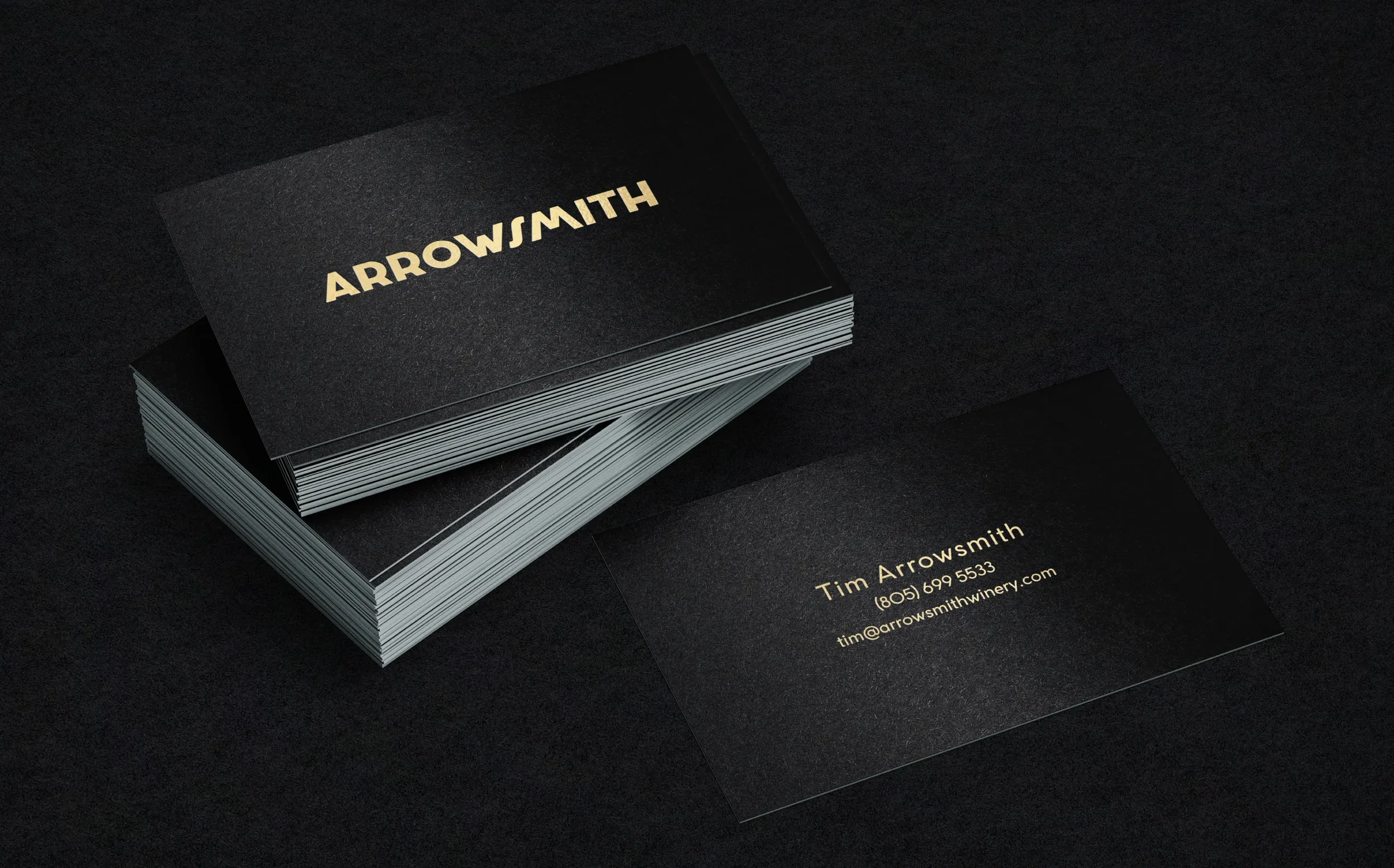
That same sense of restraint carried through to the accompanying business cards. A simple black and gold palette, elevated through the use of foil, created something professional and understated with a premium finish.
Taken individually, the projects may be very different; collectively they reflect the relationship we’ve built with Tim and Anna over a number of years. Whether it’s a new wine, a website or something entirely different, the brief changes but the approach remains the same: understand what’s needed, create something appropriate, and make it look good while we’re at it.

“I WHOLEHEARTEDLY RECOMMEND ABOVE & BEYOND. BOTH MY HUSBAND, TIM AND I HAVE WORKED WITH THEM OVER THE LAST FEW YEARS, AND THEY’VE BEEN AN ABSOLUTE PLEASURE TO WORK WITH. THEY HAVE AN INDEPENDENT, STRONG AESTHETIC SENSE, REQUIRE MINIMAL EDITING AND ALWAYS UNDERSTOOD WHAT I WANTED WITHOUT NEEDING COPIOUS AMOUNTS OF INSTRUCTIONS. ABOVE & BEYOND HAVE CREATED: PROMOTIONAL FLYERS, EVENT MENUS, BUSINESS CARDS, LOGO STICKERS, ADVERTISEMENTS, PRODUCT LABELS, AND EVENT POSTERS FOR ME; YOU NAME IT, THEY EXCEL AT ALL OF THEM! THEY’RE ALSO PARTICULARLY GOOD AT KEEPING THE BUSINESS IDENTITY SOLID ACROSS ALL FORMATS WHILST ALSO INDIVIDUALLY TAILORING IT TO DIFFERING USES—FOR INSTANCE, ADAPTING FROM A BRITISH HIGH TEA CAKE MENU TO AN INDIE ROCK CONCERT—ALL WITH MINIMAL STRESS. I’M SO GLAD TO SEE THEY’RE DOING REALLY WELL, THEY DESERVE IT.”
Anna Arrowsmith, Arrowsmith Winery