ALTURN
BUILT FROM THE GROUND UP
-
Bricklaying expertise, built to last
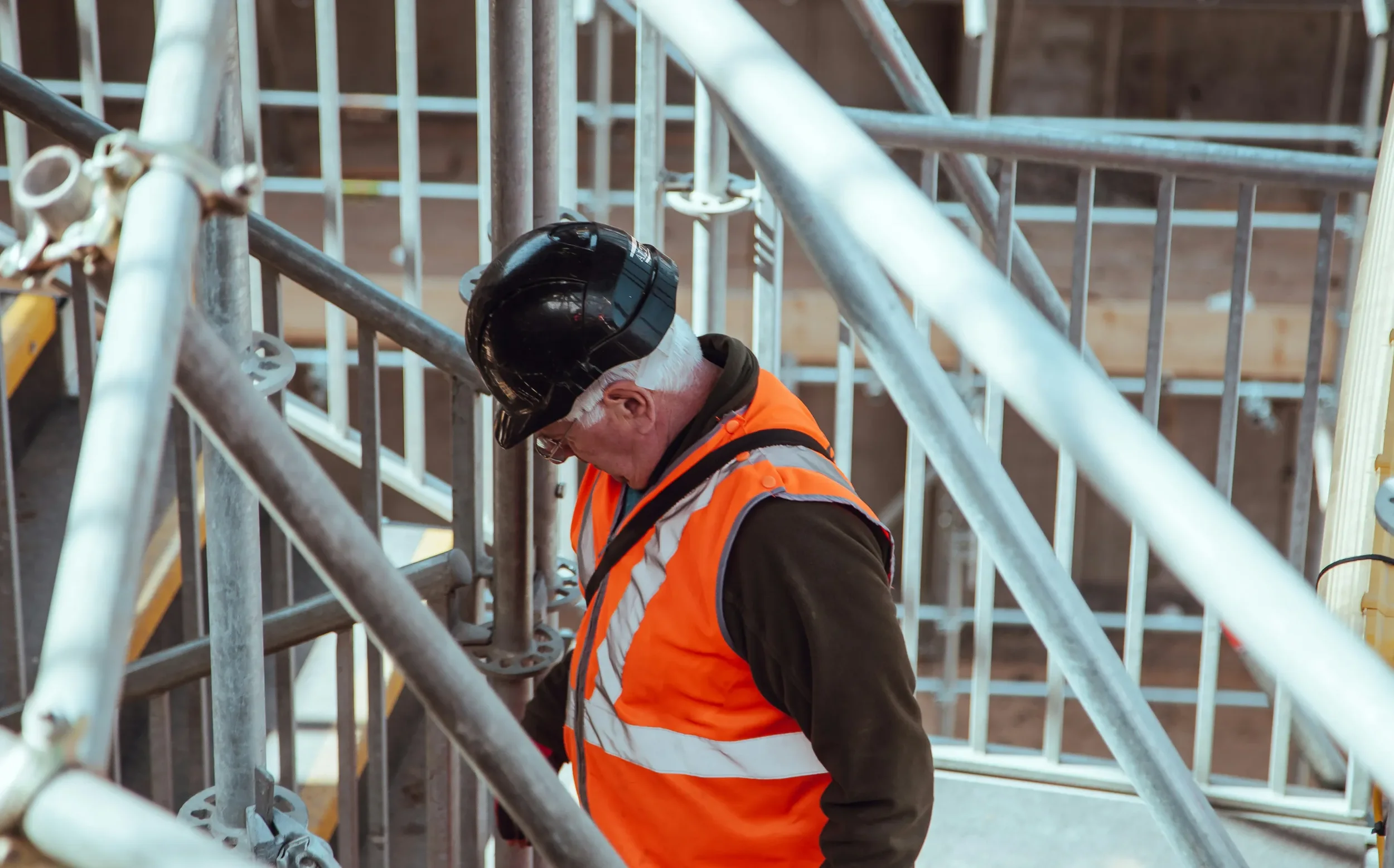
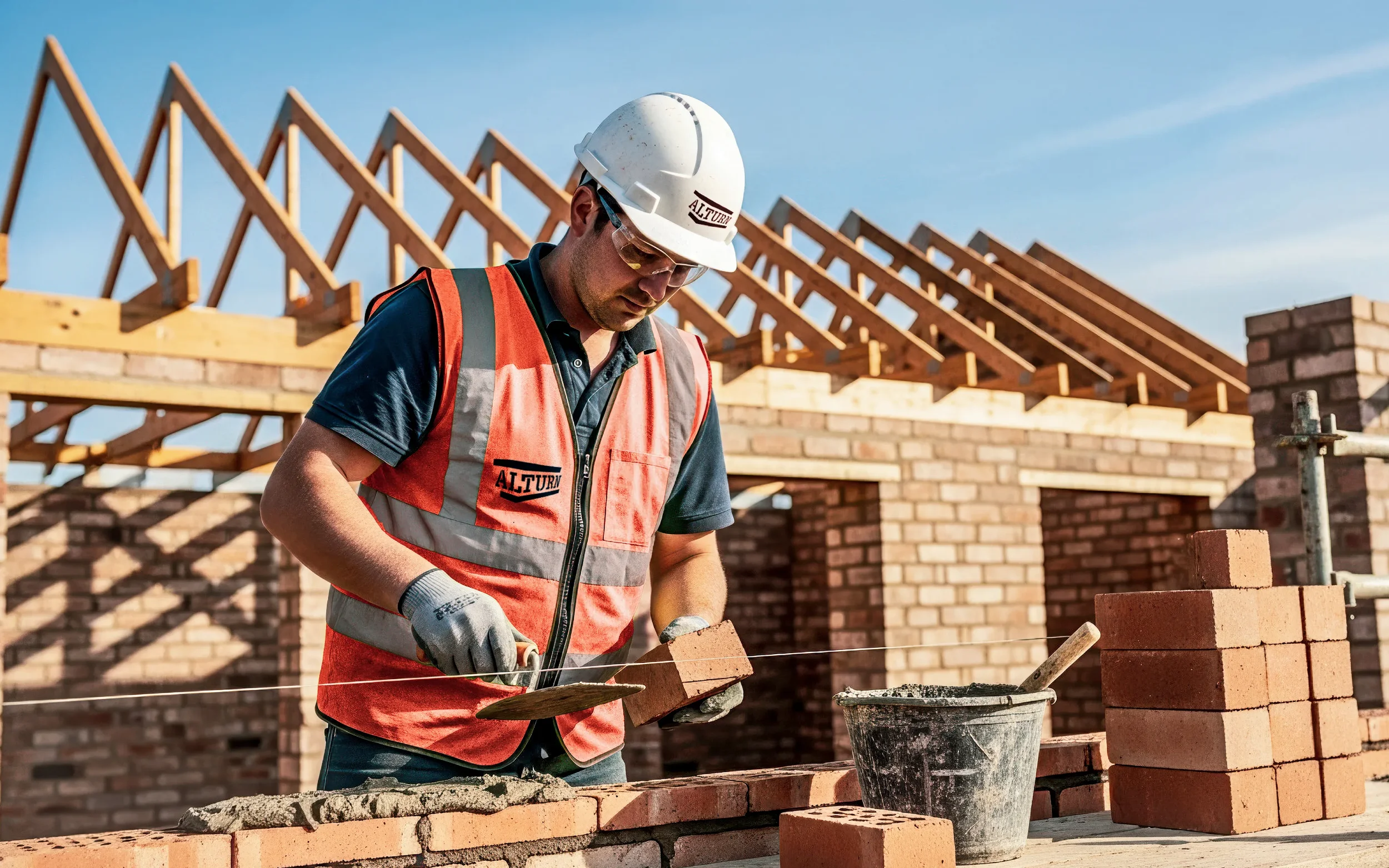
Alturn are leading bricklaying contractors serving Reading and the wider Home Counties, with more than 35 years of experience in traditional and modern brickwork. From home extensions to large commercial developments, their reputation has been built on reliability, attention to detail and exceptional workmanship. Solid foundations. -
Something solid to build on
Despite more than three decades in the industry, Alturn had never really had a brand to hang their (hard) hat on. Their focus had always been on the work itself rather than how the business presented itself, but the company had reached a point where its visual identity needed to reflect the business it had become: professional, trustworthy and reliable.The brief was deliberately open. We were given the freedom to create something modern and impactful, but it still needed to feel right for the construction industry and, importantly, remain true to the two founders who had built the business. The challenge was to find the balance between looking like a serious, established contractor and standing apart from the sea of predictable construction brands.
-
Build a brand
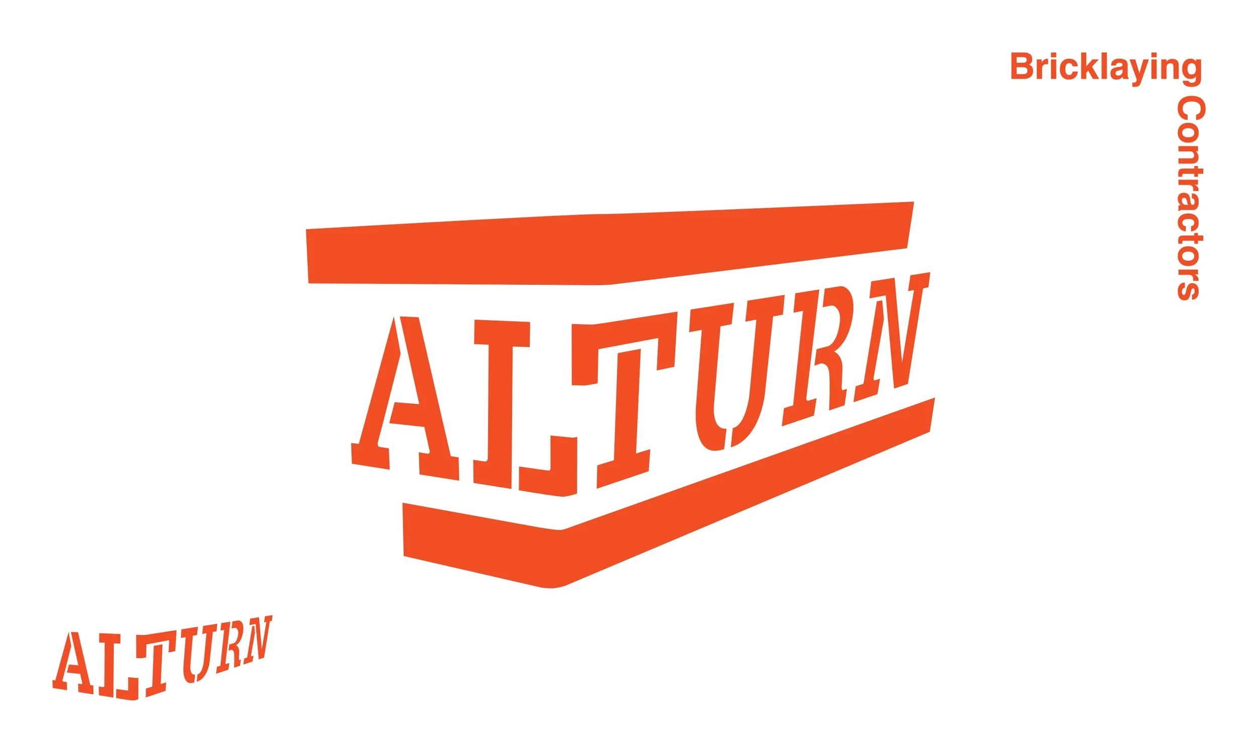
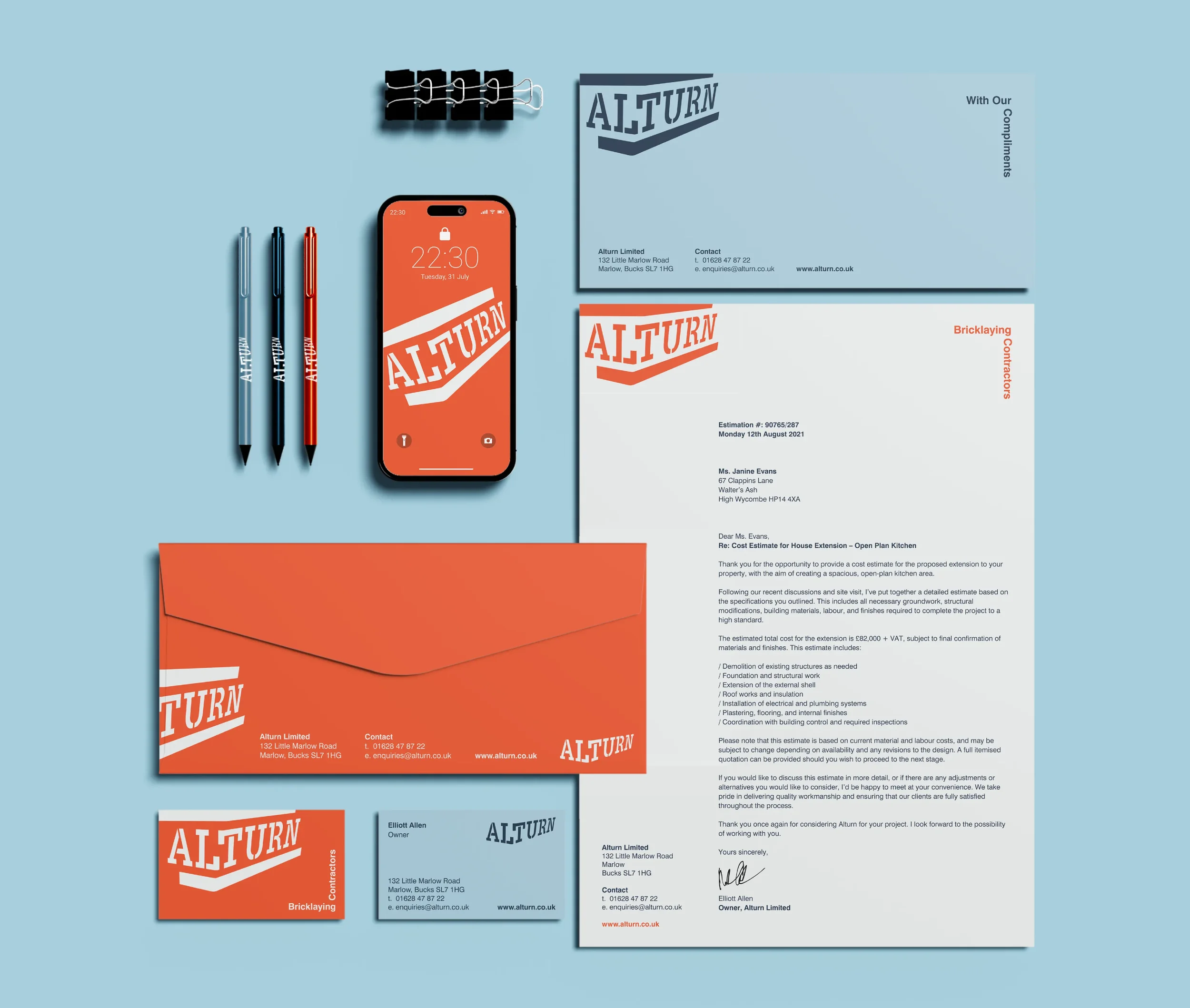
We approached the project much as Alturn approach their own work: by starting with solid foundations. The new identity was rooted in the very essence of the business — bricklaying — using the materials and patterns associated with the industry as the starting point for a distinctive visual language.Around this we developed a fresh, contemporary colour palette and paired it with classic typography that gives the brand a sense of permanence. The intention was never to create something fashionable for the sake of it, but an identity that would still feel relevant years down the line. Professional, confident and built to last.
Getting to know Alturn’s two founders also revealed an important part of the brand that couldn’t be communicated through the visual identity alone. They were both approachable, down-to-earth characters with plenty of personality, and it felt important that the new brand didn’t lose that human quality in its pursuit of professionalism.
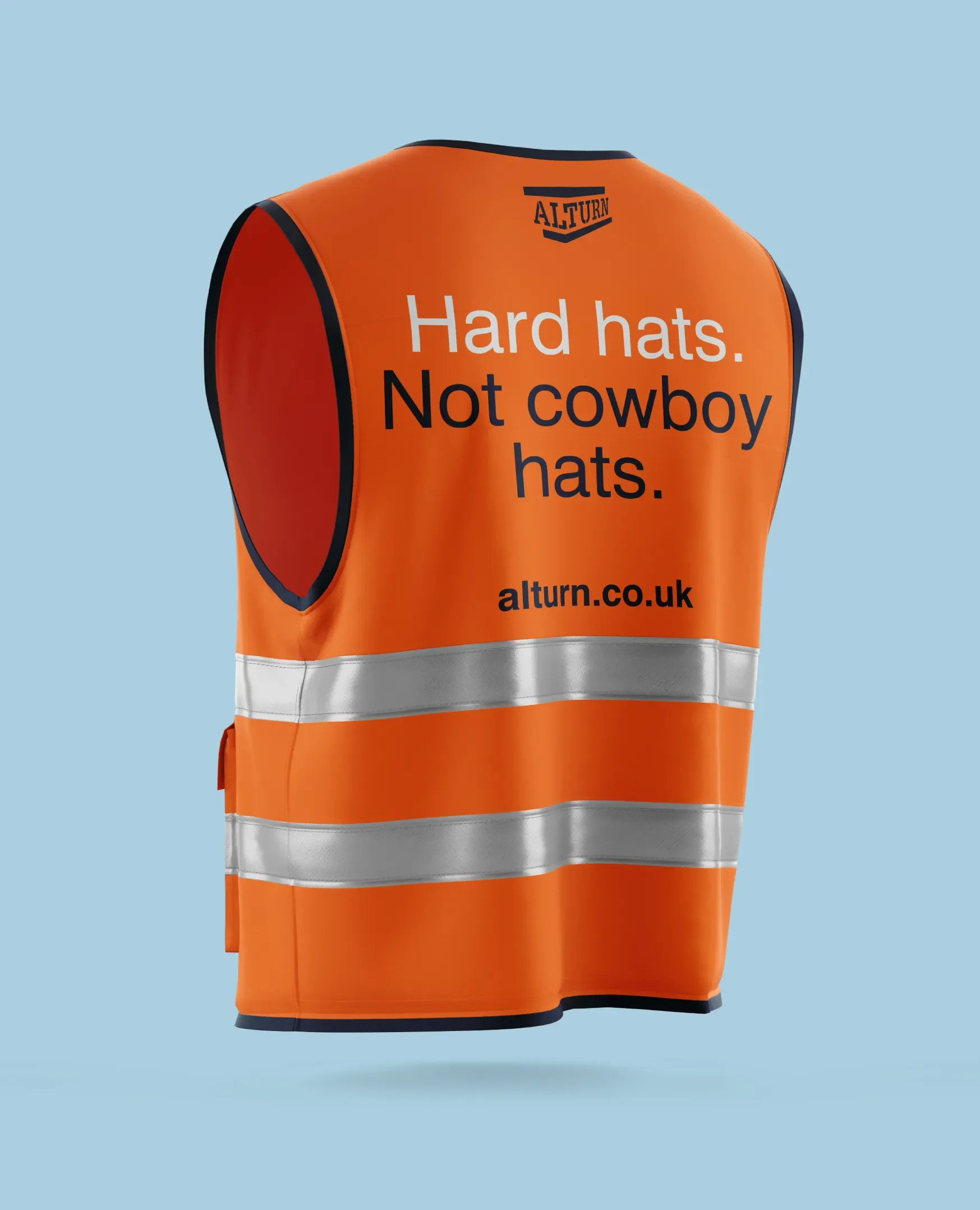
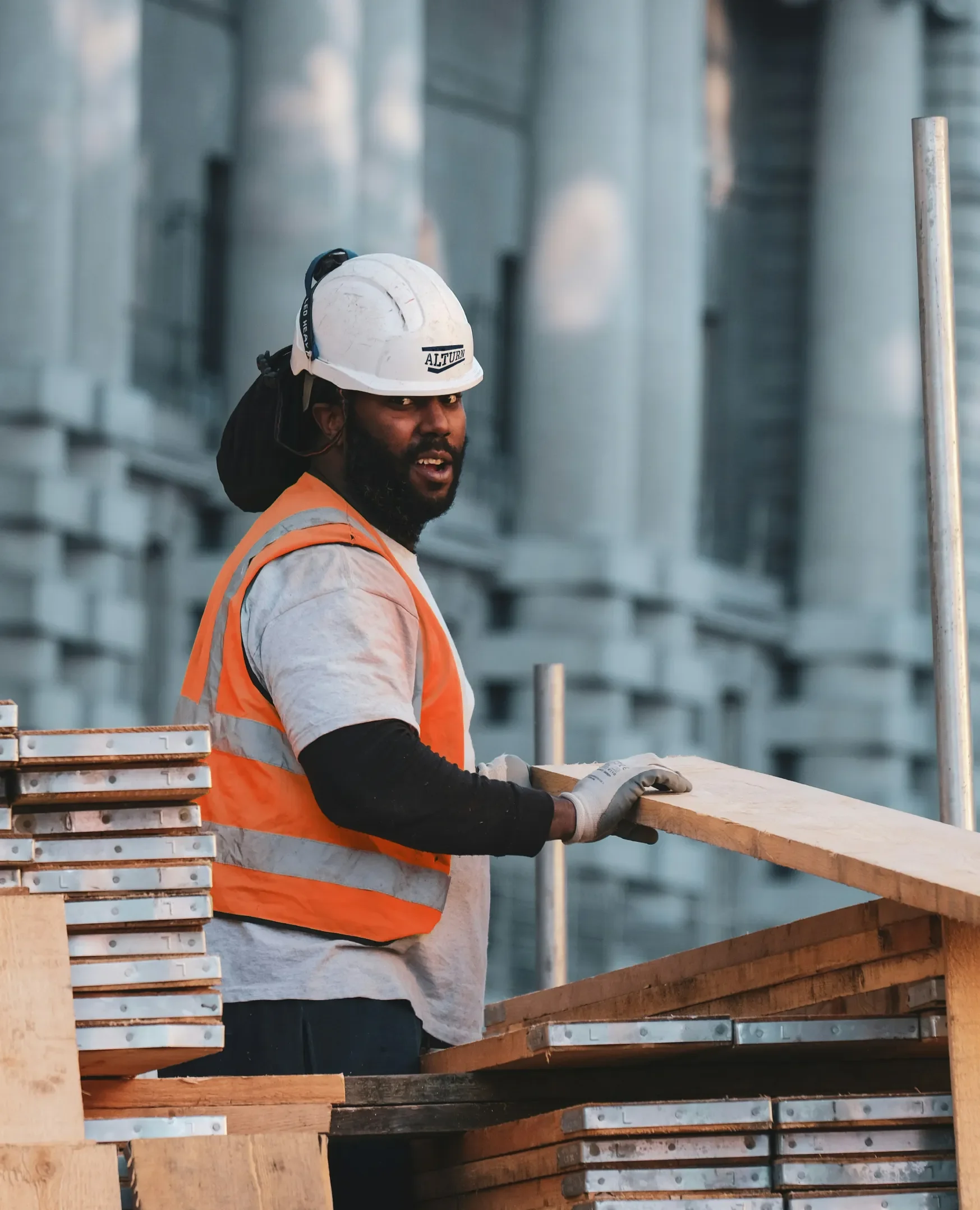
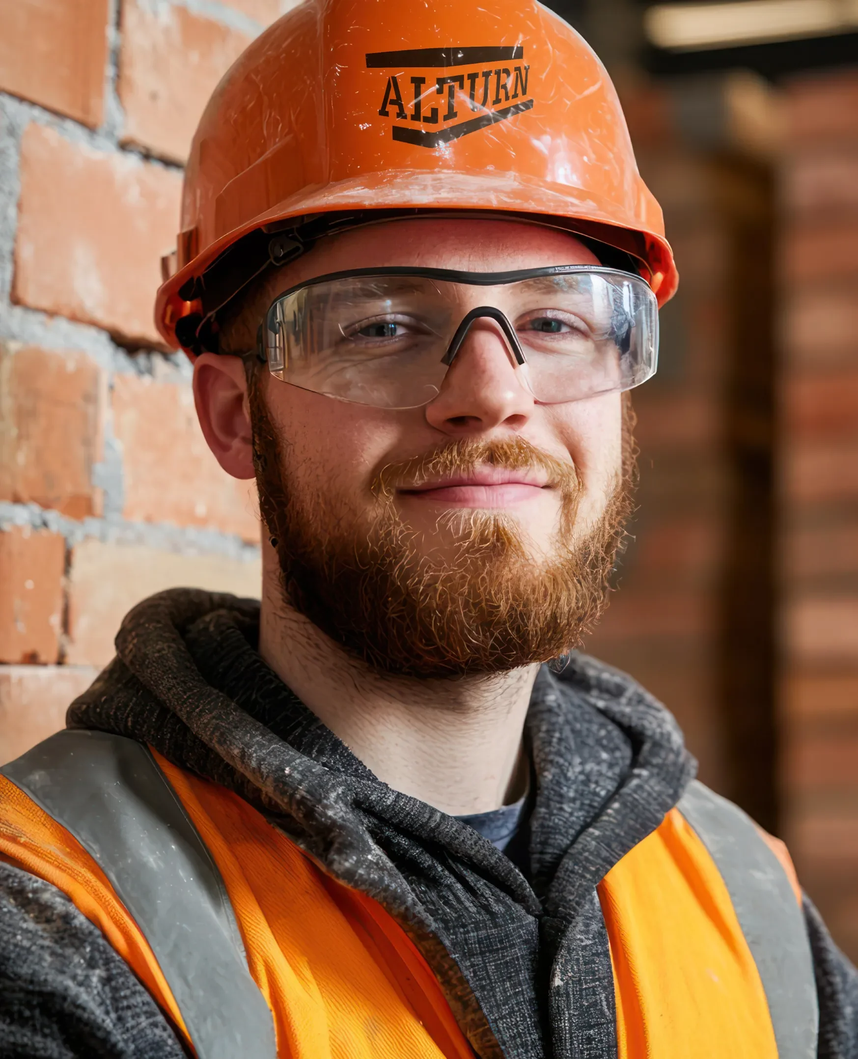
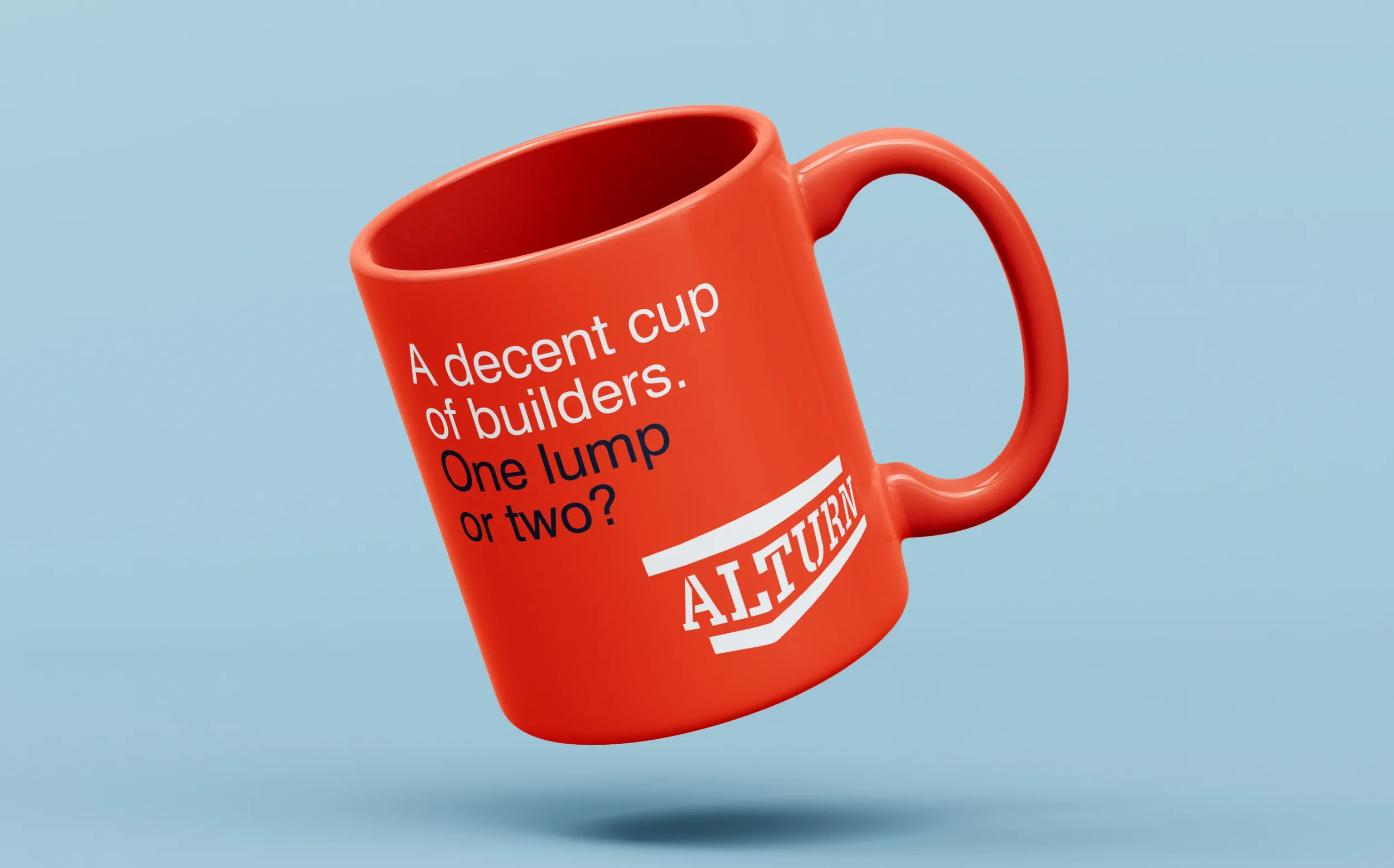
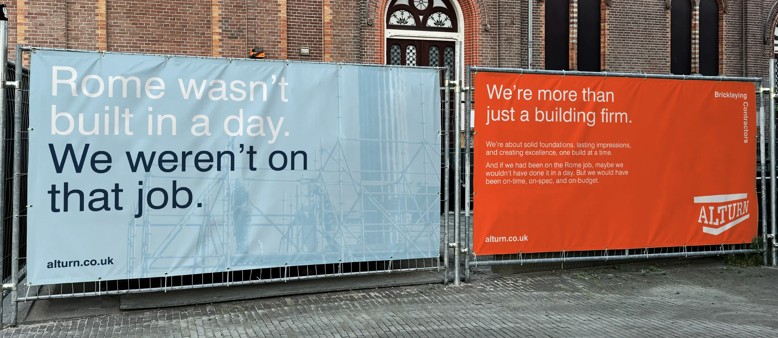
We therefore developed a tone of voice that allowed their personalities to come through. Playful messaging appeared across hoardings, advertising and even safety gear, with lines that had a sense of humour but remained firmly rooted in the industry. It gave Alturn a way to communicate that was distinctive and memorable, without compromising the professionalism that sits at the heart of the business.
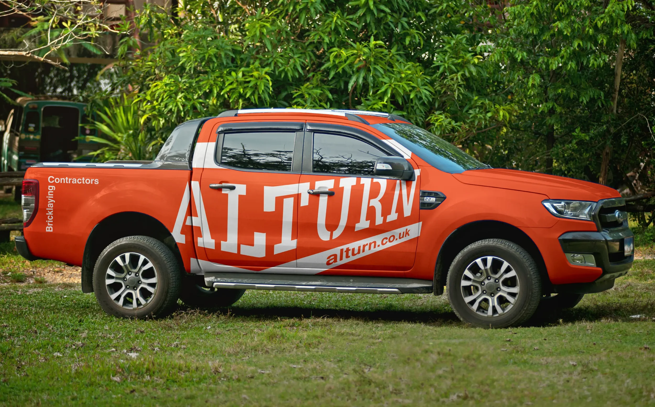
Every element of the identity was considered as part of the same system, from the logo and colour palette through to typography, messaging and application across the business. The result is a brand that looks as established and capable as the company behind it, while retaining the personality that made Alturn what it is.
Thirty-five years of experience. A brand built for the next thirty-five.